


Anatomy VR: An innovative pathway to study human anatomy.
Overview
The shift from physical to digital or hybrid models of teaching and learning in medical education was accelerated by the COVID-19 pandemic. In this shift, first-year medical students faced challenges in studying human anatomy effectively.
They require interactive, practical, and memorable learning experiences for subjects like human anatomy, which traditionally rely on in-person classes. How can we leverage technology, specifically virtual reality, to create an engaging and accessible learning solution that empowers medical students to independently and effectively study and visualize complex anatomical concepts, ensuring a seamless transition to digital and hybrid learning models while enhancing the overall learning experience?
Problem Statement
As an Individual UX/UI Designer for this passion project, I was responsible for working on the design development, including planning and executing:
Primary research
Ideation
Design and Development
Usability testing
Action
Few Initial comments
New, refreshing and friendly.
Beneficial and would be highly recommended.
The Solution
The proposed solution, "Anatomy VR," is a web-based virtual reality prototype designed for anatomy learning. This innovative platform simplifies the study of anatomy, promotes collaboration, and empowers students with self-guided learning features that facilitate independent exploration and effortless 3D visualization. Furthermore, it allows students to quickly revisit and master complex anatomical concepts, thereby enhancing the overall learning experience.
Timeline: 4 weeks.
No time to read through it?
Discover

Understanding first-year medical students’ anatomy learning experiences.
-
I conducted semi-structured online interviews with 4 current medical students, encompassing both bachelor's and master's levels, with a focus on questions focusing on their experiences of learning human anatomy.
This diverse group, consisting of two female and two male students from UNSW and USYD, were selected based on their current studies, interest in sharing their learning experiences, and openness to discussing challenges in understanding complex concepts and lectures of Anatomy studies. These interviews provided valuable insights into the user perspective, enriching my UX design process, as shown below. -
I analyzed the gathered video recording, transcribed and then analyzed it by Inductive coding, which allowed me to quantify the qualitative data into a structured, thematic analysis.
A few important and key themes can be framed as:Embracing Technological Advancements: Students aim to learn from more technologically advanced techniques and features.
Beyond Traditional Hand Notes: Students find it challenging to relearn anatomy concepts, and hand notes were not helpful.
Fostering Collaboration and Motivation Among Students: Students seek to collaborate and lack collaborative learning methods; they value and feel motivated by studying difficult concepts along with peers.
Define

Understanding Medical students current needs.
-
Studying medical science is one of the most challenging areas of study because of its vast and complex human body being the core of it.
Previously it has been found that:
Practicing, learning regularly and revisiting these concepts are standard and require significant attention and memorization power.
It is also a field where students grasp the subject matter through the "Learning by doing" approach.
However, data from 2009 indicates that the time dedicated to teaching gross anatomy was found to have decreased by 55% over the past 49 years.
-
Anatomy content is generally delivered through lectures, dissections, clinical cases and self-directed study using 2D images and multimedia resources.
However, the challenges faced by students are:
Challenges in Limited Anatomy Laboratory Access: Medical students can get up to a few hours of anatomy laboratory time each week, sharing a cadaver between 10 – 12 students. However, these sessions are tightly structured, and students cannot access the cadavers (corpses) for later revision. These tight laboratory sessions mean that the students have a limited window to learn anatomy effectively.
Challenges in Visualizing 3D Anatomy from Static Images: The teaching method also relies on the student's ability to transform knowledge of static images into 3D structures, which can be a challenging cognitive leap for those who find it difficult to visualize anatomical features.
-
Hence, findings from both Primary and Secondary research indicate that the goal is to provide medical students with an easy and collaborative learning platform that can benefit them to learn Human Anatomy faster, revisit concepts with ease and study effectively.
Note: It is important to emphasize that the primary focus of this project is to enhance the overall “learning experience” of students, prioritizing their needs over the VR technology itself.
Design decisions

Journey from Idea to the solution.
-
I started the Idea generation by focusing on popular anatomy learning apps and websites students mentioned during the Interview. Complete Anatomy 3D, Brain Tutor 3D, and Kenhub.com, were frequently used and mentioned due to their clear visualization and up-to-date information.
However, limitations with these apps/websites emerged: In terms of usability and learning abilities, students seek more advantages and collaborative features rather than just a visualization tool. Therefore, to enhance their learning experiences, I used a problem/solution table to address these challenges and start building the proof of concept.

Ideation Table
-
In the evolving e-learning landscape, integrating online and hybrid study models has become essential for both students and educators.
VR stands out as a valuable tool in medical education, offering cost-effectiveness, repeatability, and instant feedback, yet facing issues of accessibility and affordability.
-
Anatomy VR addresses all these challenges by prioritizing affordability and user-centric design, enhancing self-study, enabling collaborative learning, and improving overall usability.
The platform's fusion of 3D models, connectivity, and user control fosters student interest and confidence, making VR education more accessible and engaging and elevating overall learning experiences.
Development
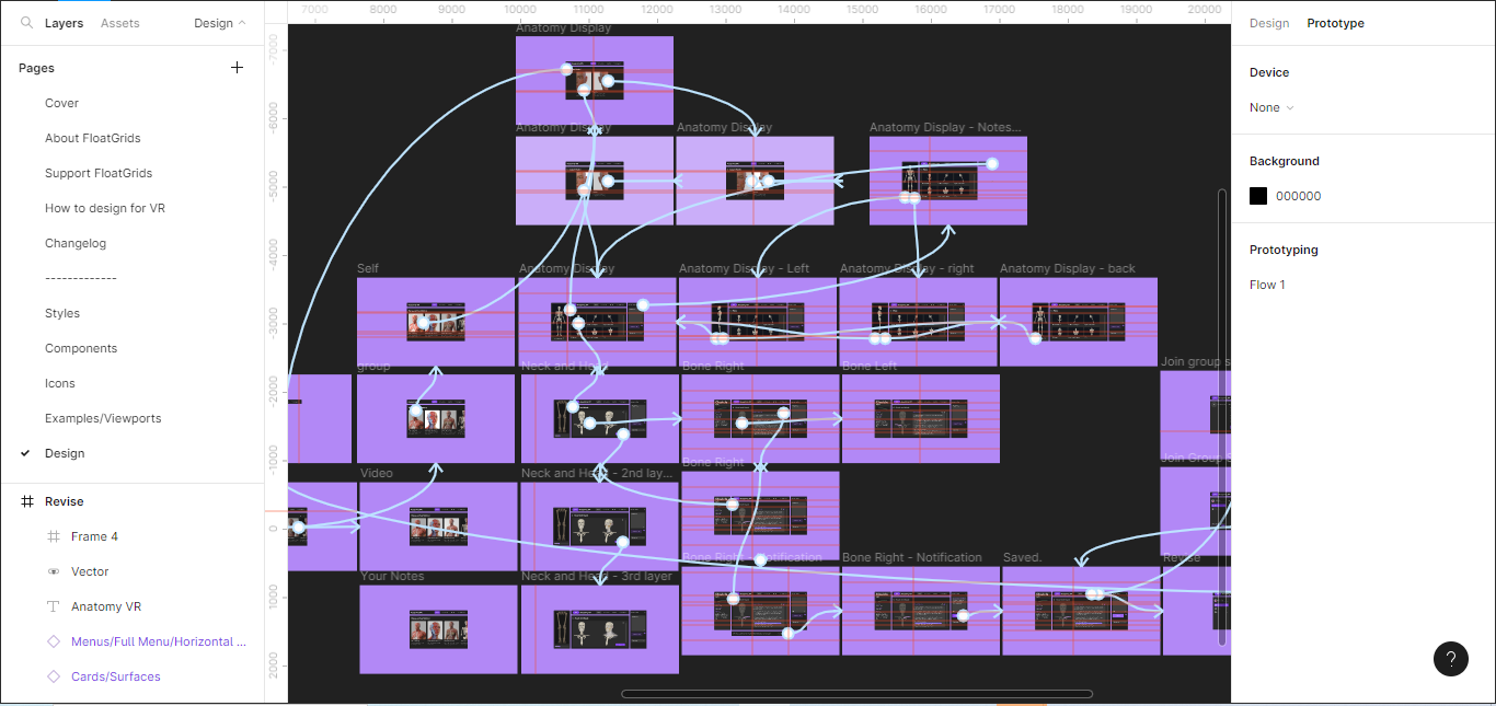
Designing the solution
VR Design Guidelines
I initially sought to validate the proof of concept by conducting trials with students before embarking on the development phase in Unity VR. However, I wanted to design it entirely based on VR Guidelines and Design Systems, which will seamlessly ease the work from Figma to Unity.
To do so, I used these 3 VR Design guidelines to translate my ideas into designs that could be tested.
-
Float Grid Design System by FloatGrids:
The designs were based on the design guidelines provided by Float Grid Design System - an experimental VR/AR Design system created using Figma and Unity to make design UI in VR easy for designers. Built under the Atomic Design methodology, it gave me highly customizable, consistent and scalable features throughout the design.
-
Oculus VR Quest (Vision):
To understand the distance in a 2D format, I considered Oculus VR design guidelines for the user’s immediate Line of Sight and Vision, which were studied and found that UI or elements displayed outside the user’s immersive line of sight are more likely to be missed. Therefore I consider the same while designing various layouts and design options.

-
Google VR Sticker sheet:
Next, I used Google's Daydream component sticker sheet to ensure the UI's best viewing distance layouts and ergonomic guides for designing screen-based UIs. The form of measurement used was the Digital Millimeter (DMM), i.e., 1dmm = 1px. Based on this, the Angular grid graphically represents the 3D space in a 2-D format.

Layout Designs
I designed these wireframe layouts using both the 12-column grid system and Angular grid specifications. This approach was chosen to ensure a consistent design approach while affording students ample space for immersive 3D content visualization.
Expansive Viewing: The primary objective was to create layouts that maximize the viewing area, offering students an unobstructed and visually engaging experience.
Enhanced Interactivity: The floating layouts aimed to optimize content distribution and interactivity. This involved experimenting with floating menus, sidebars, and viewing areas to enhance ease of information access and interaction.


User Interface
Following the wireframe layout designs, my next step was to focus on managing the UI. These pre-designed Figma UI component sets were designed within the Float Grid Design System, allowing me to use it as it is to generate design options quickly.
I considered the Float Grid Design system to be kept intact as these sets of designs were already optimized to scale and follow usability and ergonomics for VR standards. Furthermore, it will ease the delivery to the developer for further development. This will reduce conversion time and help maximize productivity.


Testing
The Testing was designed to gather both Qualitative and Quantitative results and then analyze them to conclude, find the next steps and gather participants’ reactions to the proof of concept.
Qualitative: For Usability testing, three first-year medical students participated. Participants navigated the prototype using User Scenarios while employing "think-aloud" processes, with outcomes meticulously recorded in a dedicated Usability sheet.
This evaluation considered ten key heuristics, encompassing factors such as real-world alignment, consistency, system status visibility, error prevention, user autonomy, design aesthetics, recognition over recall, error handling support, efficiency, and access to documentation.
The brief results of the Usability test were:
Among three participants, two rated the Anatomy VR experience as "Good," validating its design's innovation and fulfillment of objectives.
Two out of three participants desired mobile/iPad accessibility and the VR app.
All participants found the prototype beneficial and would recommend it to others.
Quantitative: To gain deeper insights into participants' thought processes and adaptability, a concise survey was distributed, featuring a mix of closed and open-ended questions to validate findings further.


Check the complete survey results here.
The analysis of the Survey was:
Open-ended feedback described the application as "new, refreshing, and user-friendly."
Note-taking features were well-received, and Anatomy VR was seen as a helpful guide for new students.
One participant suggested optimizing the sense of control for anatomy movement, citing prior experience with high-tech VR headsets.
The Solution
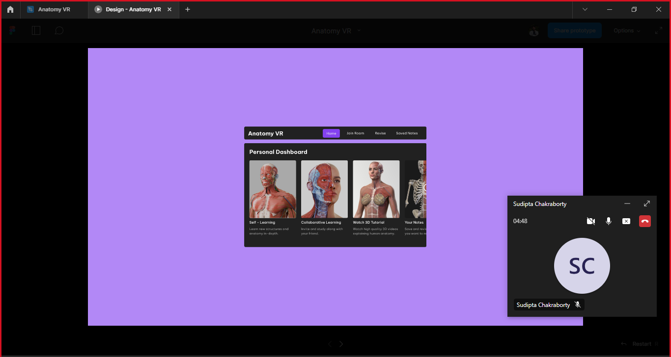
As students enter their Dashboard, they are greeted by a personalized interface designed for seamless navigation.
Within this interface, four distinct sections await their exploration: Self-study, Collaborate, Watch 3D Tutorials, and Access Saved Notes. These sections empower users to effortlessly select and fulfill their unique study requirements, ensuring tailored, intuitive and quick navigation.
01. Personalized Study Dashboard
02. Enhancing Visualization and Note-Taking
Problem Uncovered: The challenge lies in grasping complex anatomy concepts and effectively documenting lecture content.
Experience and Solution Presented: I crafted a solution that offers seamless control over 3D models, allowing users to add or remove layers for in-depth visualization effortlessly. The interactive platform provides swift access to detailed anatomical parts, surfaces, and landmarks. Furthermore, it facilitates highlighting crucial notes and offers user-friendly note-saving features to enhance the overall learning experience.
03. Fostering Collaborative Learning by Peer Study Connections
Problem Uncovered: The absence of peer learning capabilities.
Experience and Solution Presented: The “Join room” feature allows students to create an account using their student email and generate a unique session code. This code can then be shared with friends, enabling them to join a collaborative study session through call or video chat. Furthermore, students can collaboratively create group notes conveniently saved in both participants' "Saved Notes" sections, fostering effective teamwork in the learning process.
Problem Uncovered: Navigating challenges in revisiting previously learned concepts effortlessly.
Experience and Solution Presented: Within the "Revise" section, students gain access to comprehensive information categorized into Skeletal, Muscular, Nervous, and Terminologies, facilitating quick reference to essential content. Additionally, students can effortlessly retrieve their saved notes from previous sessions, ensuring easy access to valuable information when needed.
04. Revisit and relearn concepts with ease.
My Learnings & Next Steps.
Learning
Importance of VR in Medical Education: This project's challenging aspect was designing for VR without actually being in that environment. This is primarily due to my lack of access to the VR setup. However, through research and development phases, I first hand explored integrating emerging technologies like VR design guidelines to enhance the learning experience in medical education. This taught me the importance of being relevant and up-to-date with technologies that shape our lives.
More testing will lead to a better user experience: While constraints limited the ability to engage a large group of students for prototype feedback, the testing phases underscored the critical value of ongoing user feedback in meeting their evolving needs. This realization emphasized the imperative of conducting additional testing sessions to attain the finest product outcome ultimately.
Next Steps
Figma to Unity: The next step for me would be to consult a VR developer and work along with his/her guidance to build this prototype in Unity VR. This will allow me to gather VR development learning, test with more participants- in a better enviornment, and reiterate based on feedback.
Improve Accessibility: Lastly, I would explore options to make the platform accessible on a wider range of devices, including mobile and iPad versions, which can cater to a larger audience, including educational institutions - potentially partnering to encourage adoption.
If you came this long, Thank you for reading!

Play my game, instead?
Rogue Rhapsody - 2D Pixalated rhythm-based game for entertainment and rhythm-enthusiasts.
