

Occubuy
Redesigning the Brand Identity and UX conversion for Occubuy - a Sydney based startup changing the Home-ownership game resulting in increased brand awareness, recognition and download by 3000+ users.
Brand Guideline, Brand Identity design, Web & App UX/UI Design.
Roles & Responsibilities
Design Lead: Design Direction, Brand Visual Research, Competitive Analysis, Storytelling.
Web Design: Ideation, UX flaws research, Implementation.
Timeline and Team
1.5 Months, July 2024 - October 2024.
Jr. UX/UI Designer: Kasey Lin ↗
Tools
Web Development: WordPress - Elementor.
Ideation & Design: Sketching, Figma, Adobe Photoshop & Illustrator.
Background
Occubuy is an Australian start-up dedicated to making homeownership achievable, simple, and stress-free.
Occubuy had a strong vision of representing renters, and worked towards providing incentives every time you pay your rent via their app. However, the challenge they faced were:
To build trust among the new users,
Create a sense of achievement and,
Increase brand reach and make an impact with the brand storytelling.
Prior to my initial meeting with the Founders, I proposed a brand refresh by conducting a UX and Brand Audit to identify the necessary and significant improvements. I determined that the Brand Identity was the first aspect of the project that needed attention.
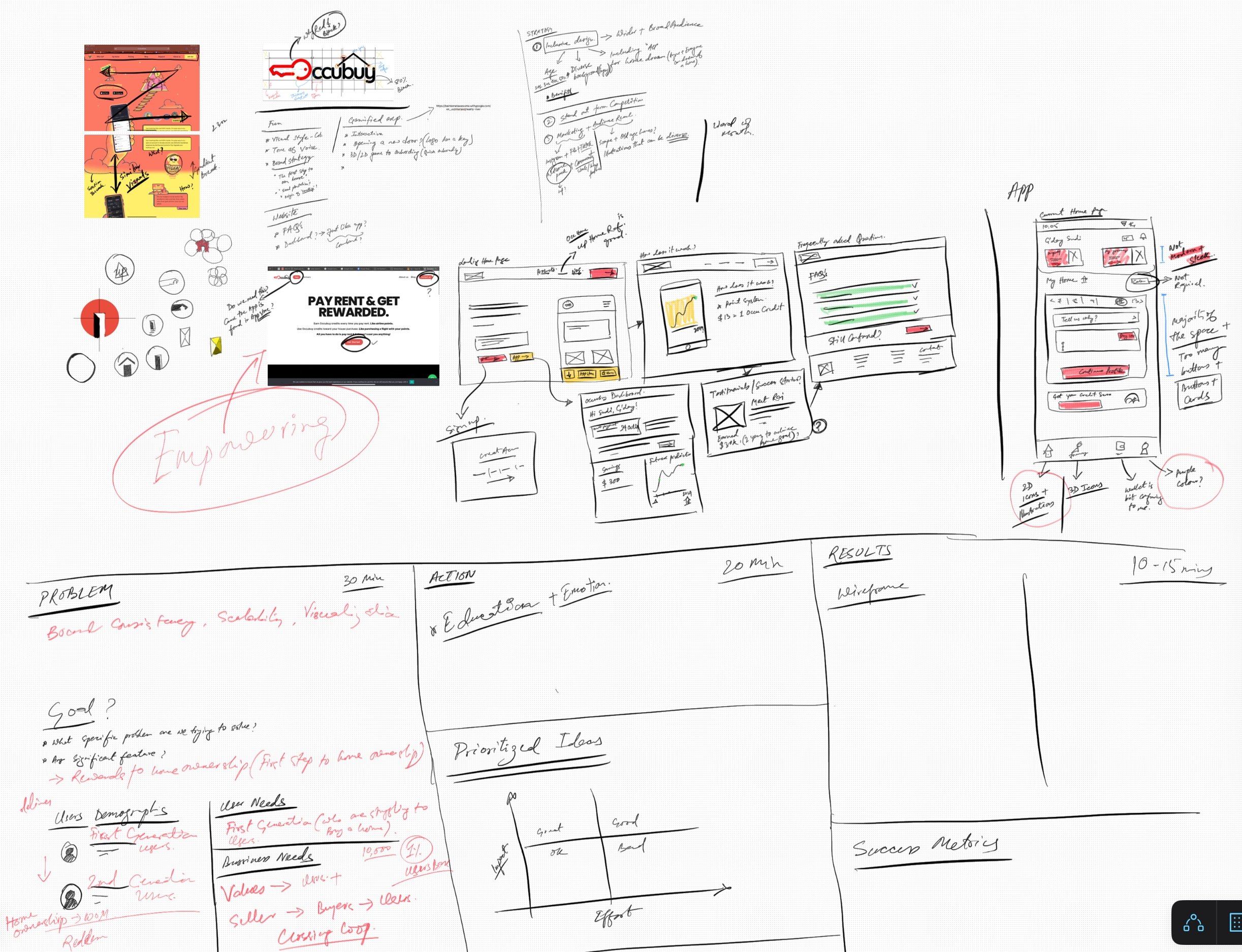
Problem
The issue stems from the Brand Identity and Visual Storytelling, which exhibited an inconsistent design style, messaging, and overall aesthetics (including imagery, color, typography, and scale) on the website and the published app. To get a sense of it, I downloaded the app myself and was unable to trust or use its payment gateways to pay my rent. This inconsistency hindered the brand's ability to convey its problem-solving approach and uniqueness through design.
Solution
A concise brand guideline emphasizing the building blocks for the brand storytelling, Website design directing users for easy downloads resulting in increase in user base, online brand awareness and 3000+ downloads within 1 month.


Impact
Over 3,000 downloads on both Google Play and the App Store.
1,500 new followers on Instagram, Facebook & over 1M view on TikTok.
Our Approach
Sprint 1
Building Logo Design & Branding Questionnaire
Meeting notes Analysis
Market Research (Desk) - Visual Trends/Competition.
Mood & Theme Boards
Competitive Analysis
Sprint 2
Logo & Brand Design
Design Direction Presentation
Logo Design + Feedback
Feedback Analysis
Sprint 3
Brand Guidelines - First Draft
Mid-fi Wireframes
Sprint 4
Usability test user scenarios
Heuristics Evaluation + Design Refinement
Experience Test Scenarios
Roleplay as User
Experience Testing + Design Refinement
Things I led
Sprint 1: Scoping, Benchmarking, Inspiration & Brand Research.
My first step was to understand the scope of the design here. Given such a tight timeframe - I had decided on building a Questionnaire that can help me, and Kasey analyze and act on the next steps. The branding redesign process was to thoroughly understand the founder’s vision for the new brand. We began by conducting in-depth interviews and facilitating collaborative workshops, which allowed us to dive deep into their ideas, preferences, and core values. I used this Brand Questionnaire to answer all the required thoughts and structure our analysis.
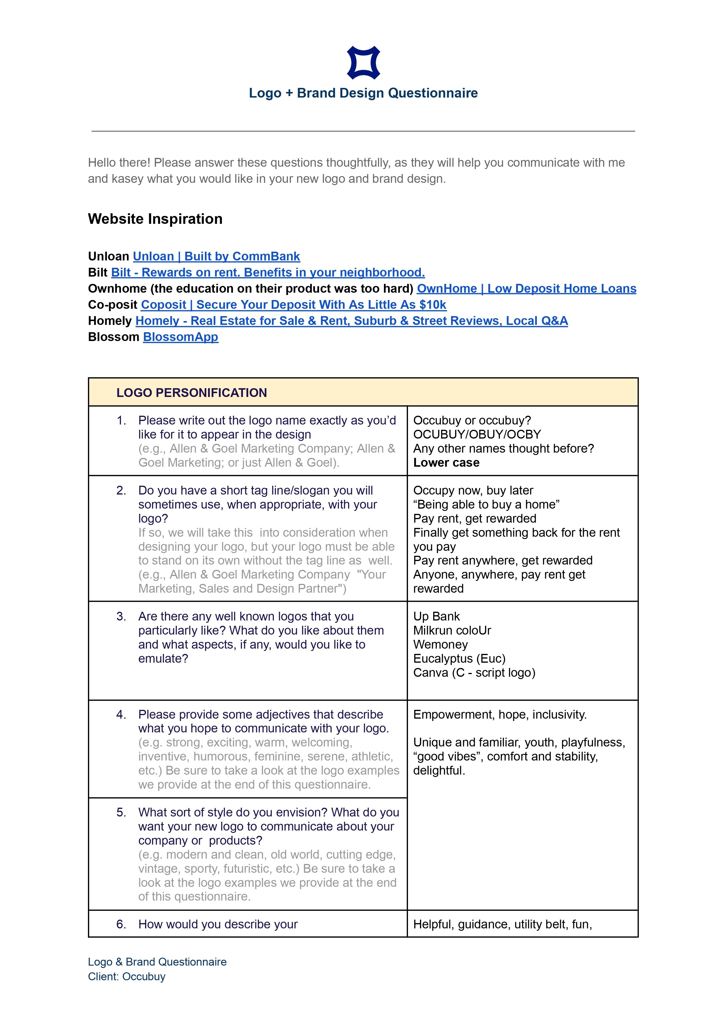
A website homepage titled 'Logo + Brand Design Questionnaire' with instructions and a series of questions for logo design, including links to related websites and a section for logo personality questions.
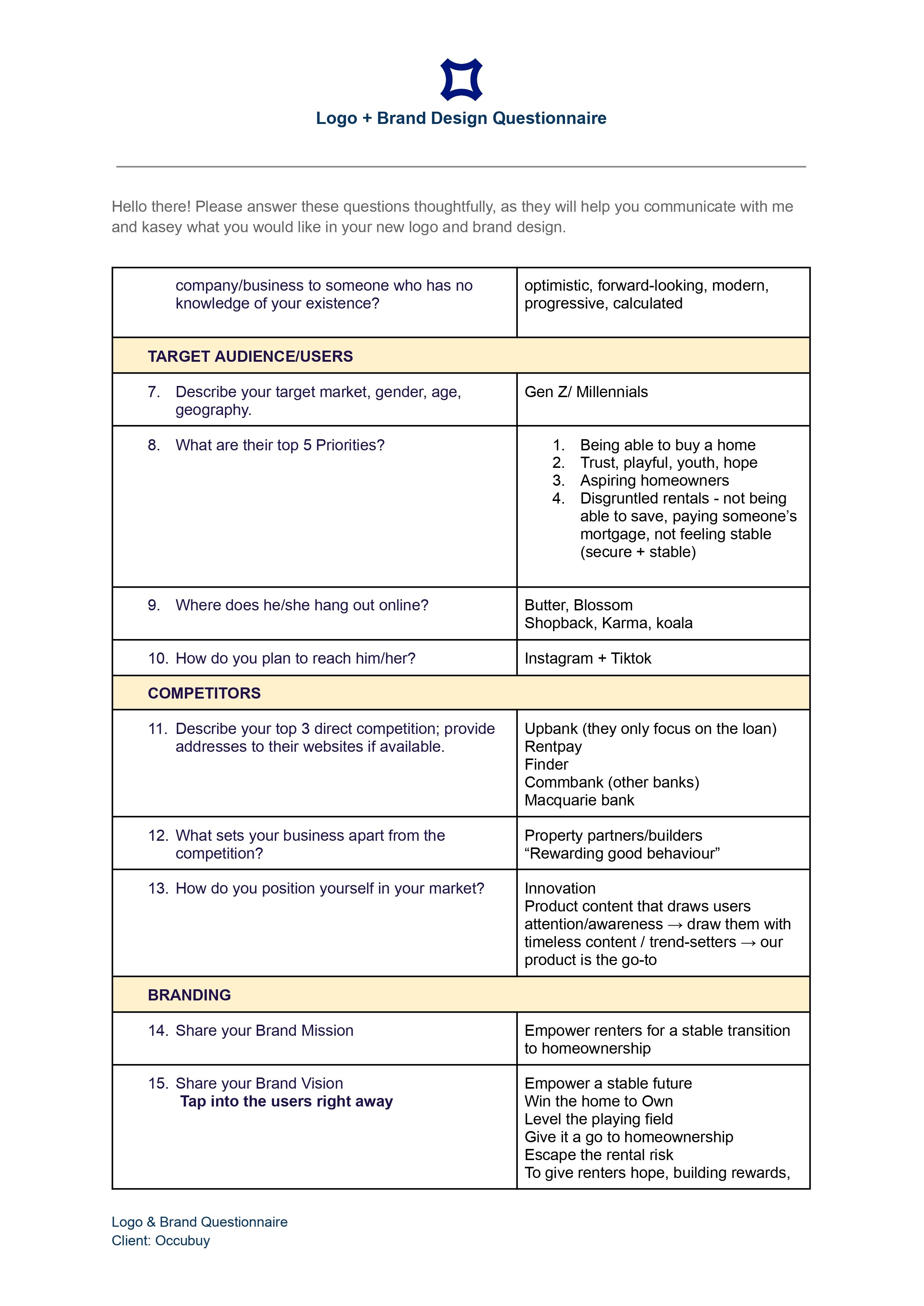
A logo and brand design questionnaire document with sections for target audience, competitors, and branding for client 'Occubuy'.
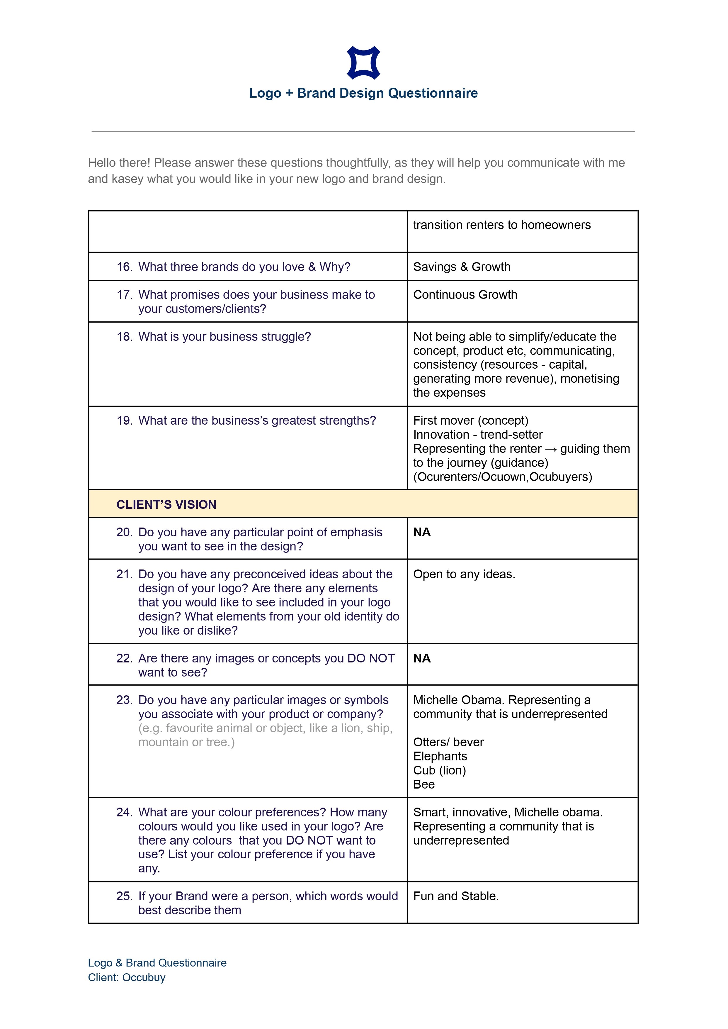
A branding questionnaire form titled 'Logo + Brand Design Questionnaire' with questions about brand preferences, strengths, and client vision, including a section about preferred images and symbols.
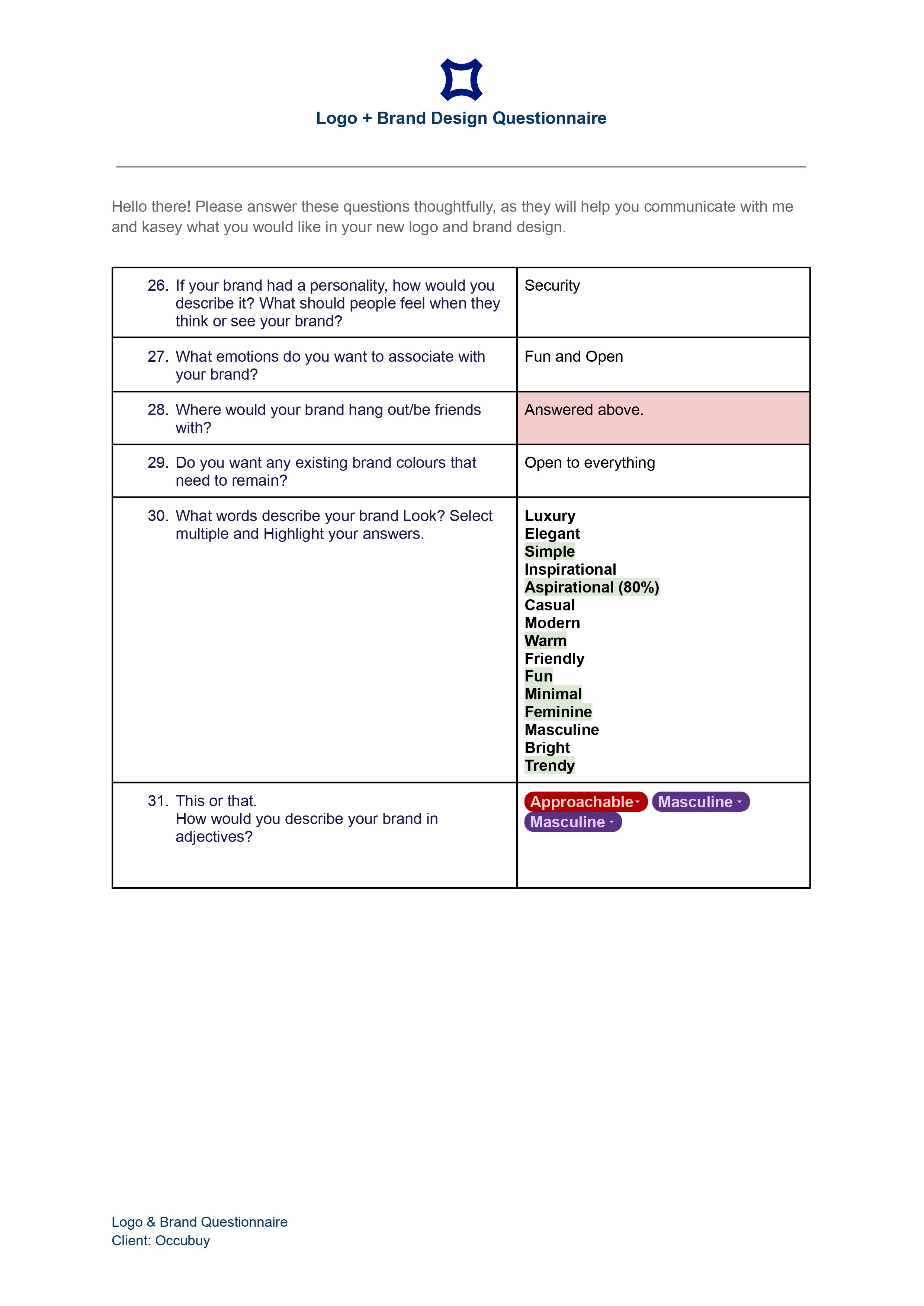
A questionnaire titled 'Logo + Brand Design Questionnaire' with questions about brand personality, emotions, colors, words, and adjectives, and spaces for responses. The logo at the top features a dark blue shield-like icon.
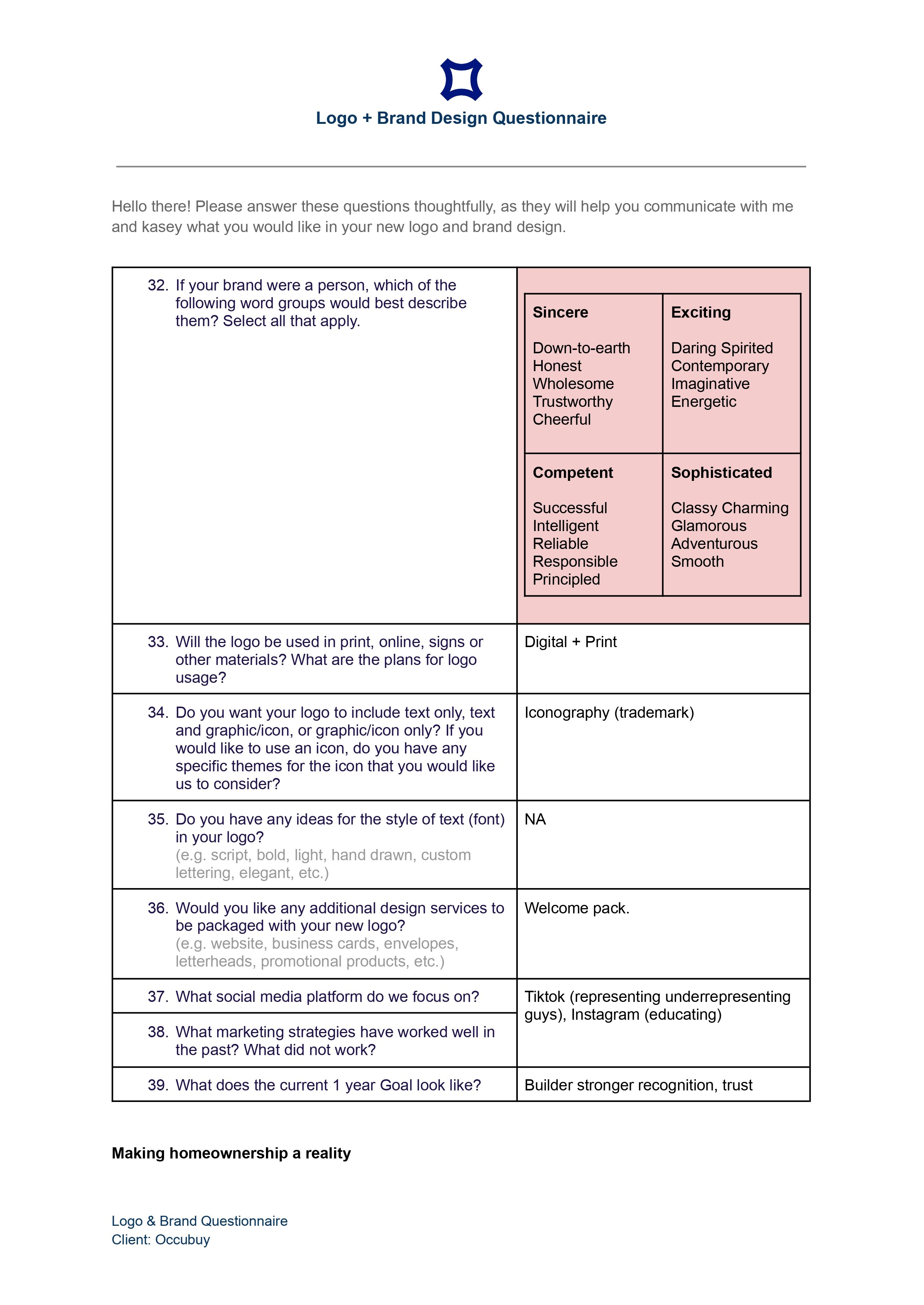
A brand design questionnaire with questions about logo usage, design preferences, social media strategies, and marketing goals for a client named Occubuy.
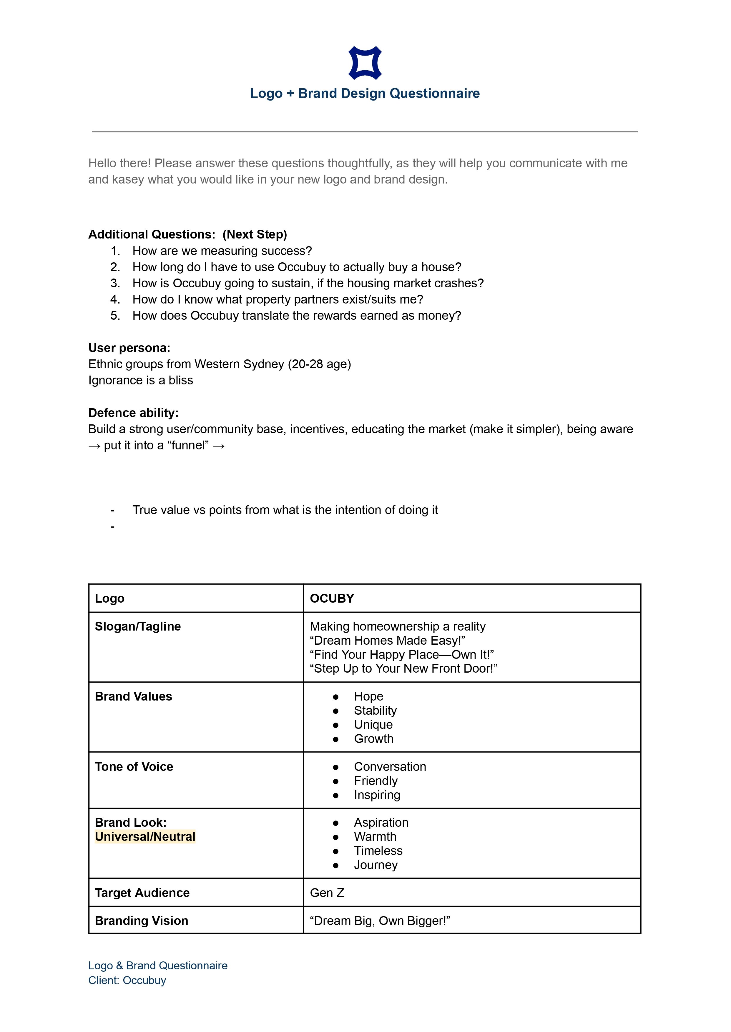
A branding questionnaire document titled 'Logo + Brand Design Questionnaire' for a client named Occuby. It includes questions, user persona details, defense strategies, and a detailed table outlining brand values, tone of voice, logo, slogan, target audience, and branding vision.
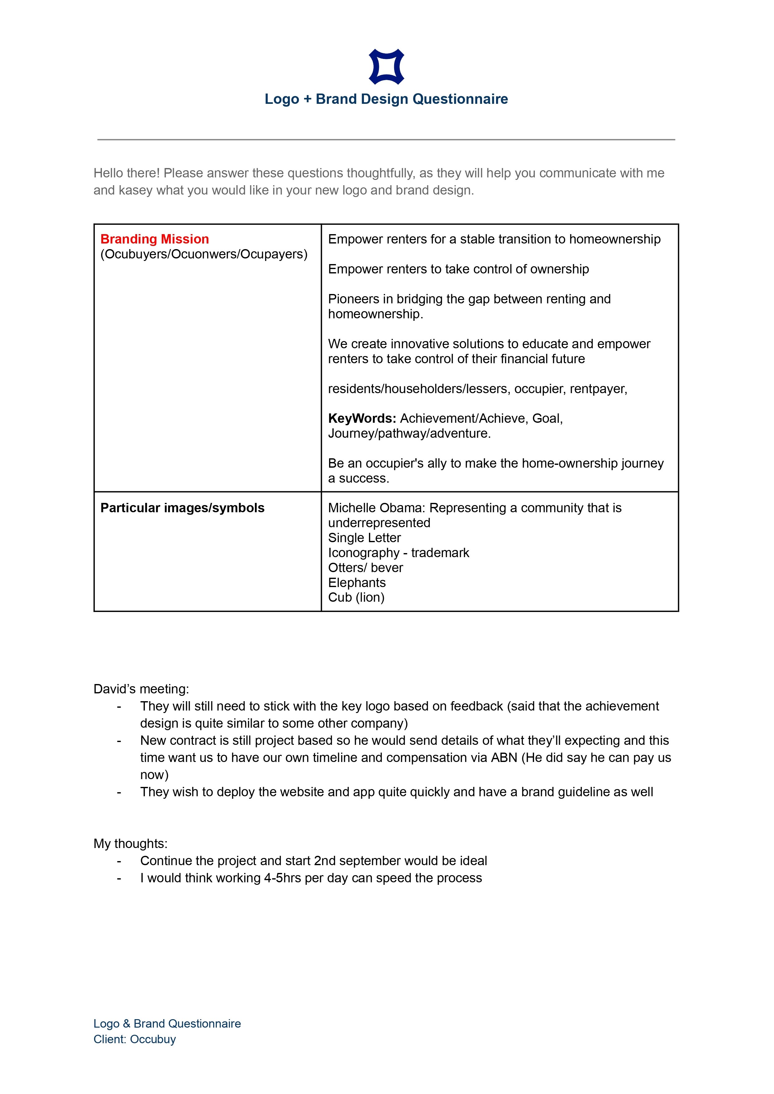
A branding mission statement and notes for a logo and brand design questionnaire for a client named Occubuy, including images and symbols representing Michelle Obama, a single letter, and animals like otters, elephants, and a lion.
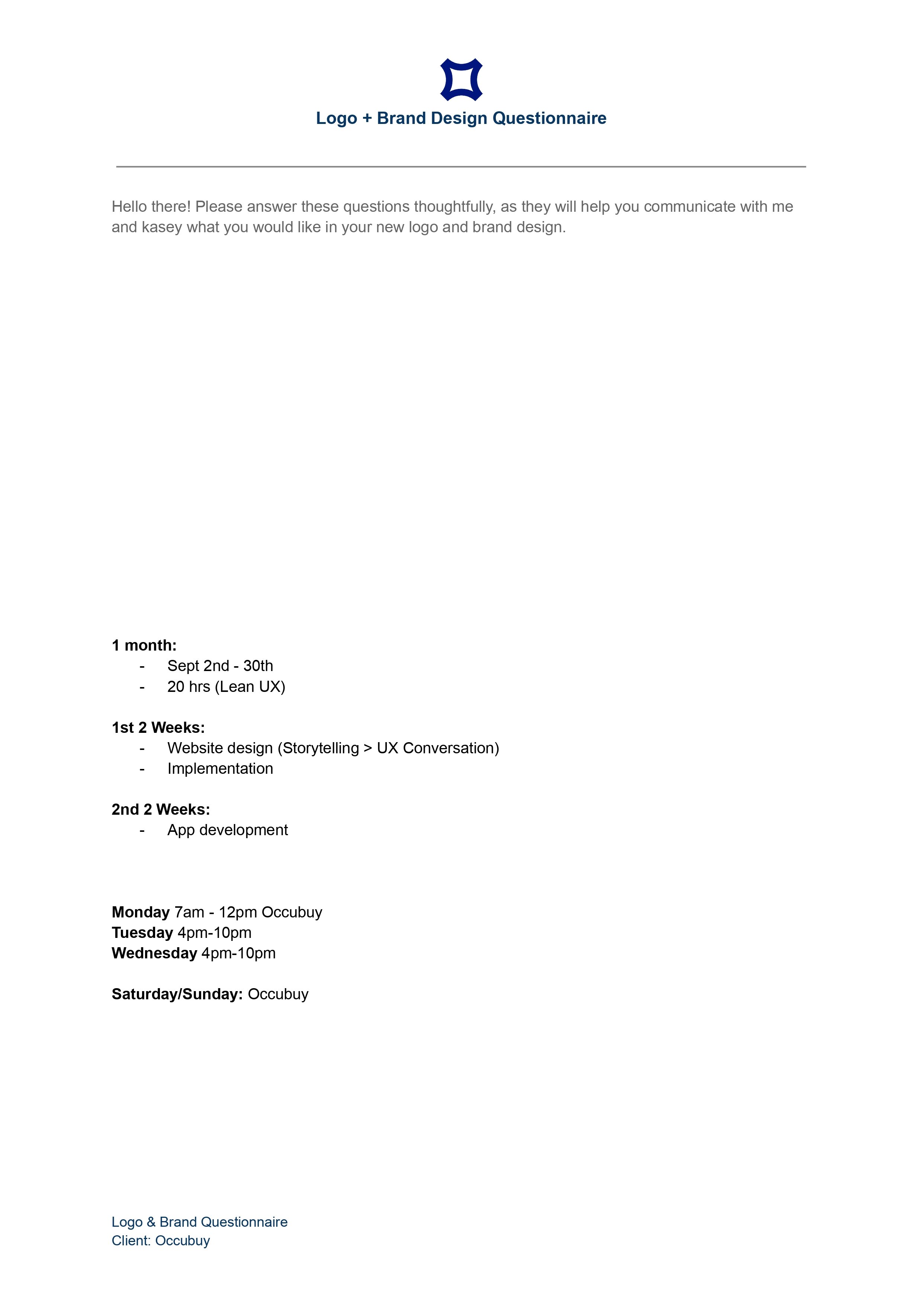
A brand design questionnaire form with a logo at the top, titled 'Logo + Brand Design Questionnaire'. The form contains instructions and a schedule for a project, including phases like website design, implementation, and app development, with specific dates and times. The bottom left corner notes the client as 'Occubuy' and repeats the title and client information.
Market Research - Visual Trends/Competition
Our first step in the branding redesign process was to thoroughly understand the founder’s vision for the new brand. We began by conducting in-depth interviews and facilitating collaborative workshops, which allowed us to dive deep into their ideas, preferences, and core values.

Brand Guidelines - First Draft
Sprint 2: Brand Presentation & Feedback analysis
Given our research findings, we devised three divergent design ideas that tackled the problem space. These spanned from building a Night Travel Learners (e-learning app), Night Cravers (Night Local Food Finder) and Opal Games (collaborative online game session).
Peer review
We pitched our design Ideas to three diverse audience groups to evaluate and verify the best Idea that efficiently solves the problem. An online vote was made to assess interest in the designs, and the audiences we presented were:
Classmates/peers during our tutorial sessions at UTS.
Faculty and Tutors (Stakeholders) and,
5 Night shift workers from our Interviews.
We chose the design idea with the highest score for option 3 – Opal Games.
The review showed us that the concept was scalable, focused on the engagement of daily commutes, and, given Opal Travels' more extensive customer base, would be a more thoughtful way for adoption.
Benchmarking design standards
Design standard 1: Respecting Opal Travel.
To integrate our idea successfully within the Opal Travel application, We first had to understand the existing branding and UI design language. To do so, I broke down the present Opal Travel app design elements for our team, which include Grids for spacing, consistent typography, buttons, color palette, and iconography. I wanted to ensure we don’t redesign, respect the present design, and seamlessly add our new ideas.

Spacing, Color and Grids system.

Specifying cards and dividers

Typography sizes
Design standard 2: Being Memorable.
The initial name we decided on during our Ideation phase was Opal Games. However, I believe our solution offers more than just games. Therefore, to visually represent “add on/upgrade,” I described it as a “+,” which means an additional edge added to your commute experiences and an indication of the free upgraded service provided by Opal Travel.
Design standard 3: Association through colors.
Lastly, the intended use case of Opal+ would aim to uplift commuters' motivations during nighttime commutes. Therefore, I drew inspiration from the Sydney train carriage's exterior colors and Opal Travel logo mark to represent the same. It provided a blended sense of energy and fun (where Orange evokes joy, warmth and enthusiasm, and Yellow elicits happiness, energy, and optimism).
Modified Opal+ Logo.

Color palate inspired by Sydney trains exterior.
Iterative Design & Testing
We decided to design our Mid-fidelity prototype of the app tailoring to address the 3 major user pain points specifically (Group 1,2 & 3). To do so, we used our design artefacts as our base. In specific, we used the User persona and User Journey to aim the needs, User flow developed by my teammates based on rough sketches of our selected Idea, and the style guide I created as Interface guides. Moreover, we decided to continuously evaluate the app’s usability and navigation while we design the rest of the critical features.
Thus, to evaluate and gain feedbacks into the user flow, usability and experiences of the Mid-Fidelity prototype, User Testing Scenarios were created.
We used two testing methods: Usability testing(with three night shift workers) using Nielsen's heuristics and Experience testing(role play of the participant by the designer referring persona), which was conducted to gather valuable feedback and determine the scope of improvements for the UX of the Opal+ high-fidelity prototype.
Testing phase 1: 3 Usability testing of night shift workers (room setting - based on User Scenarios).

Testing phase 2: User-Experience evaluation (Inside metro - based on Experience Scenarios)
Challenges + Design modifications based on feedback
One of the challenges we initially discovered through testing was verifying whether the user was a genuine Night shift worker accessing the Opal+ game mode. Participants were curious to know if they were playing with like-minded commuters or not. I wanted to ensure that the solution cater to the intended User group and makes them feel exclusive.
Therefore, I aimed to set up an Opal+ QR code that only activates after 3 pm and lets the users verify the train carriage, enter the Game mode and determine the recommended games based on real-time travel timings. This also ensures that the games are only played during the commute and not otherwise.
We initially planned to put the QR code on the station information board and inside the train next to the Sydney train map. However, we had to drop both ideas after testing because participants had trouble accessing the QR on the platform while hurrying, and it got blocked inside the train when a person in a wheelchair used that space, affecting others' privacy.

Usability Test report - severity of the problem.

QR Idea 1: QR beside the Sydney train network map.

Therefore, my next idea was to use the QR code as a sticker placed above each seat. On the app, a visual feedback page providing actionable steps has been added - to guide the user during the onboarding, reducing anticipation and confusion. This allowed participants to quickly and safely access the QR while preventing errors.

Results
This modification resulted in excellent navigation, use case and user experience providing concrete user satisfaction.

Another major issue we encountered was with the new Opal+ home dashboard, where participants were not sure about the information provided on the Mid-fidelity prototypes Game scorecard. Additionally, there was confusion in understanding the information presented and what actions to take forward.


Usability Test report - severity of the problem.
Left - Before Testing, Right - Changes made after feedback.
However, This was not the end.
Experience testing results provided in-depth details of how these changes were still confusing and unclear so the participant could take informed action. To simplify the Home page design, I studied Opal Travel Home page sections and mimicked them to maintain the information look and functions similar to Opal Travel. I kept usability factors such as memorability and learnability in mind while designing, which resulted in a pleasant user experience and smooth transition.

Results
This approach focused on the making the app easy to understand for the participants and helped me improve the designs, making them easier to use without needing to learn complex interactions, thus enhancing the overall user experience.

Reflections.
The non-linear journey of being an Interaction designer hostilely has always been fascinating to me. I kept discovering people, culture, and everyday scenarios where, despite the many technological advancements, we still need designers, always looking for ways to improve our lives. As a result, this makes me feel seen, important and valued as a responsible human designer.
This was my last UX project at uni, and through this project, I realized that the word “User Experience” is no longer similar to what I previously imagined, learned and thought it was. Mostly, because of its breadth and depth in understanding a society’s reality through real stories, behavior, sources of happiness, habits and everyday lifestyle - this project has opened a new exciting pathway for me to learn about demographics.
I worked with my fellow teammates, who collaborated to tackle the challenge and complimented each other’s skill sets. Although a Uni-project, the memorable aspect was our realistic approach - it made a clear difference between a 'no-constraints' Class project and a ‘real-life project.’ I specifically enjoyed this approach.
If I had more time transparency.
Not all business operates in a linear fashion, neither the design process. I do understand the complications of running a business with limited resources and tight-to-rushed outcomes as expectations. However, given clear communication and business transparency I would have produced a fine-tuned great quality work that would have converted more users, established a strong Brand Identity resulting in a great product-market-fit. If I revisit this project again, I will surely utilize the brand guidelines created to craft the website and app to have a cohesive brand element and ensure consistency is achieved.
Lastly, I would get my invoice paid early before commencing any work.
