
Tese.io
How designing an SME loan application fueled Tese’s market launch and validation.
Product (UX/UI) Design | Web Design | MVP Launch
Roles and Responsibilities
Lead Product Designer: 0→1 Product Design, UX Strategy, Visual design direction.
UI Designer: Web design, Rapid prototyping, Cross-Functional Execution, Dev Handover.
Timeline and Team
Jul – Aug 2023
Dev: Dhruv & Content/Video: Natlie Hua
Tools
Task Management: Monday & Slack.
Design & Development: Figma, Photoshop & Squarespace.
Background
Tese.io was born to bridge a critical gap in business finance. Its core aim is to make sustainable funding accessible, transparent, and straightforward for growing companies (SMEs). The founder, Kuzi, envisioned a dual-sided digital platform:
For SMEs: Simplifying green financing and connecting them directly with the capital needed to accelerate their environmental initiatives.
For Financial Institutions: Providing the trusted infrastructure and verifiable ESG data needed to scale sustainable lending and manage portfolio impact with confidence.
The Hypothesis
Based on the founder's early market findings, we believed that SMEs face a massive roadblock as traditional commercial loan applications are notoriously dense, slow, and intimidating—especially when factoring in complex green eligibility requirements. For an early-stage startup testing an unproven business model, our core assumption was simple: if we didn't turn this messy financial qualification process into a fast, clear, and reassuring digital experience, business owners would walk away before giving us a try.
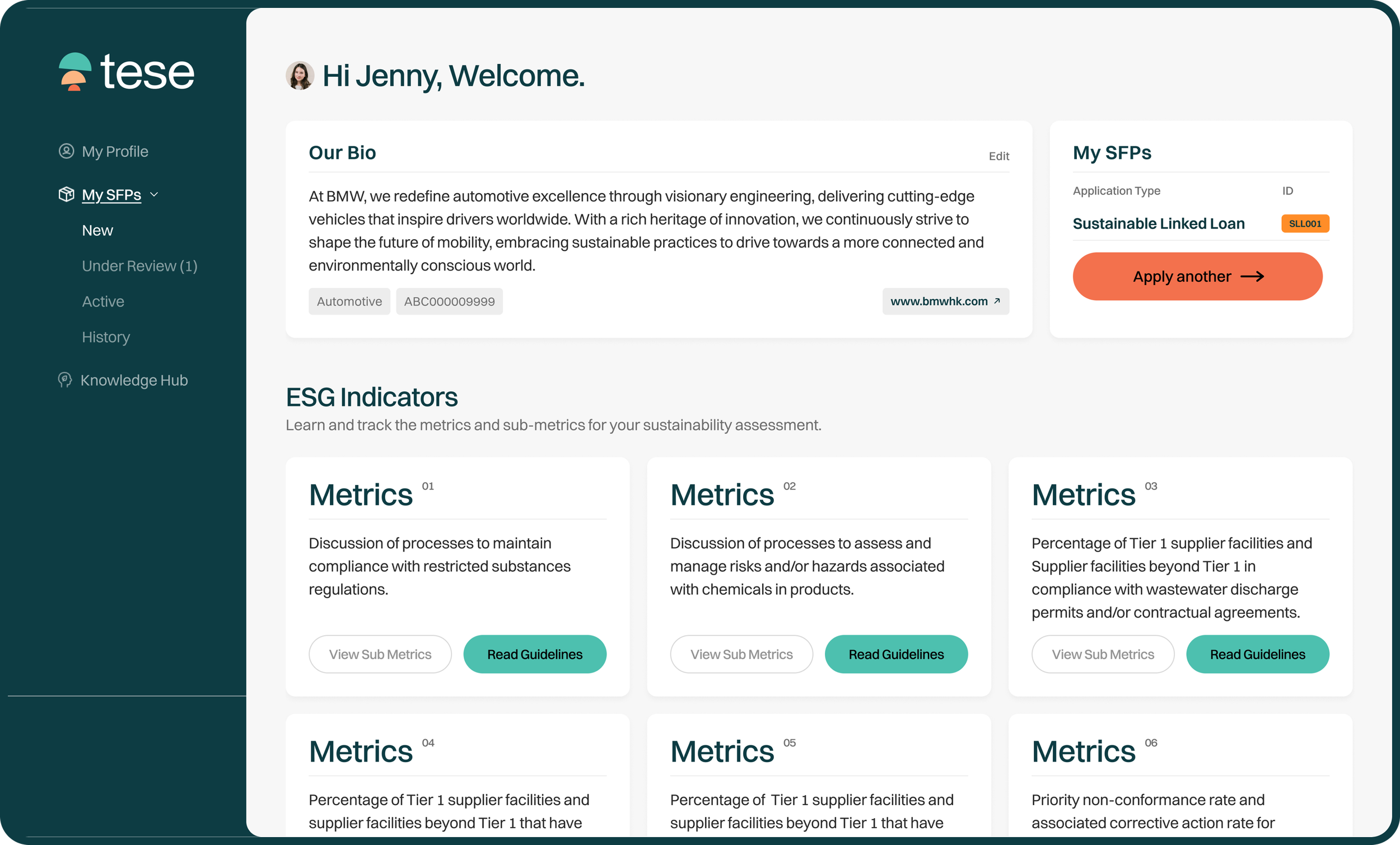
Tese Dashboard
My initiatives
As the Lead Product Designer, I partnered directly with founder Kuzi to translate the vision into a live, market-ready product. Before jumping into solutions, my priority was aligning with the founder to manage expectations early—focusing strictly on core experience design rather than getting pulled into scope creep. To bring this to life under real-world startup conditions, I navigated three key trade-offs:
Time
Faced with tight, split development windows, instead of spending weeks on deep research, I focused on my judgment—making fast, smart choices based on simple UX patterns and the founder's insights to keep us moving.
Technical Limitations
Working within strict engineering boundaries with a solo developer, I made sure to include engineering constrains, efficiency and expertise early, helping me to design modular, lightweight components to ensure a seamless dev handover and execution.
Resources
Operating as a lean team of four, I personally owned the end-to-end scope—spanning project roadmaps, UX workshops, UI design, and brand identity—without dedicated user research or copywriting support.
Operating in a zero-to-one environment, I delivered:
The Brand's Digital Footprint: Designed and helped launch Tese’s initial website to establish early credibility and market presence.
The SME Loan Application Flow: Architected and designed an intuitive, multi-step application experience to simplify complex green financing requirements.
Solution
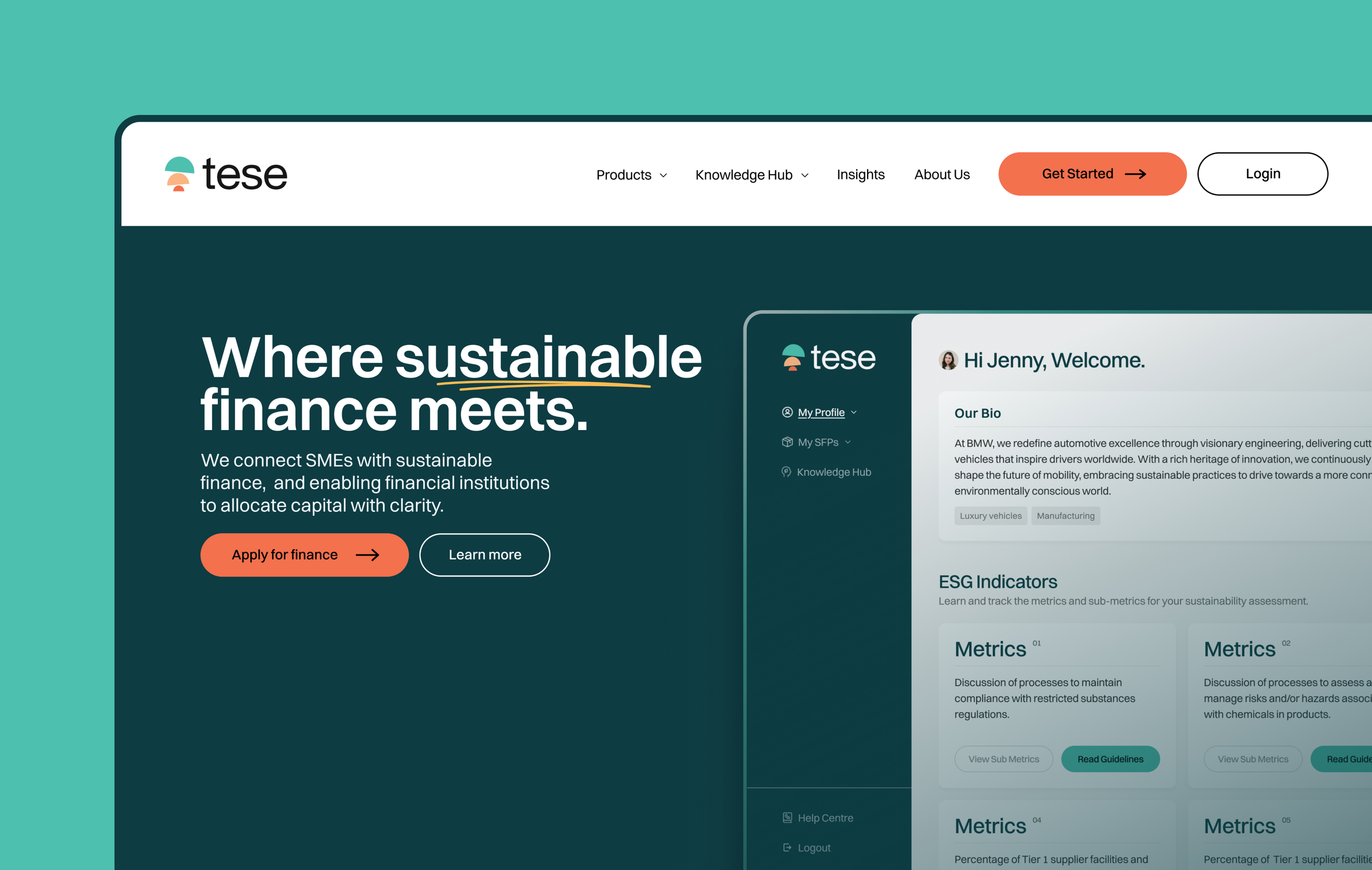
01/ Designing the brand’s digital footprint.
Impact
Accelerating Market Entry by delivering Tese’s initial website, establishing instant market credibility and paving the way for the founder to raise awareness, platform's beta launch and litmus test.
Establishing online presence
With the toolkits visual direction, I decided to take a systematic approach and rules that can be applied repeatedly and consistently. Rather than treating every screen as an individual design exercise, I translated Otherway’s visual identity into a robust, production-ready design system built on Figma Styles, and Variable specifications powered by Tailwind CSS guidelines.
These included the the complete foundational design elements and product UI components.
Tese Landing Page
Section 2: Products & Work methodology
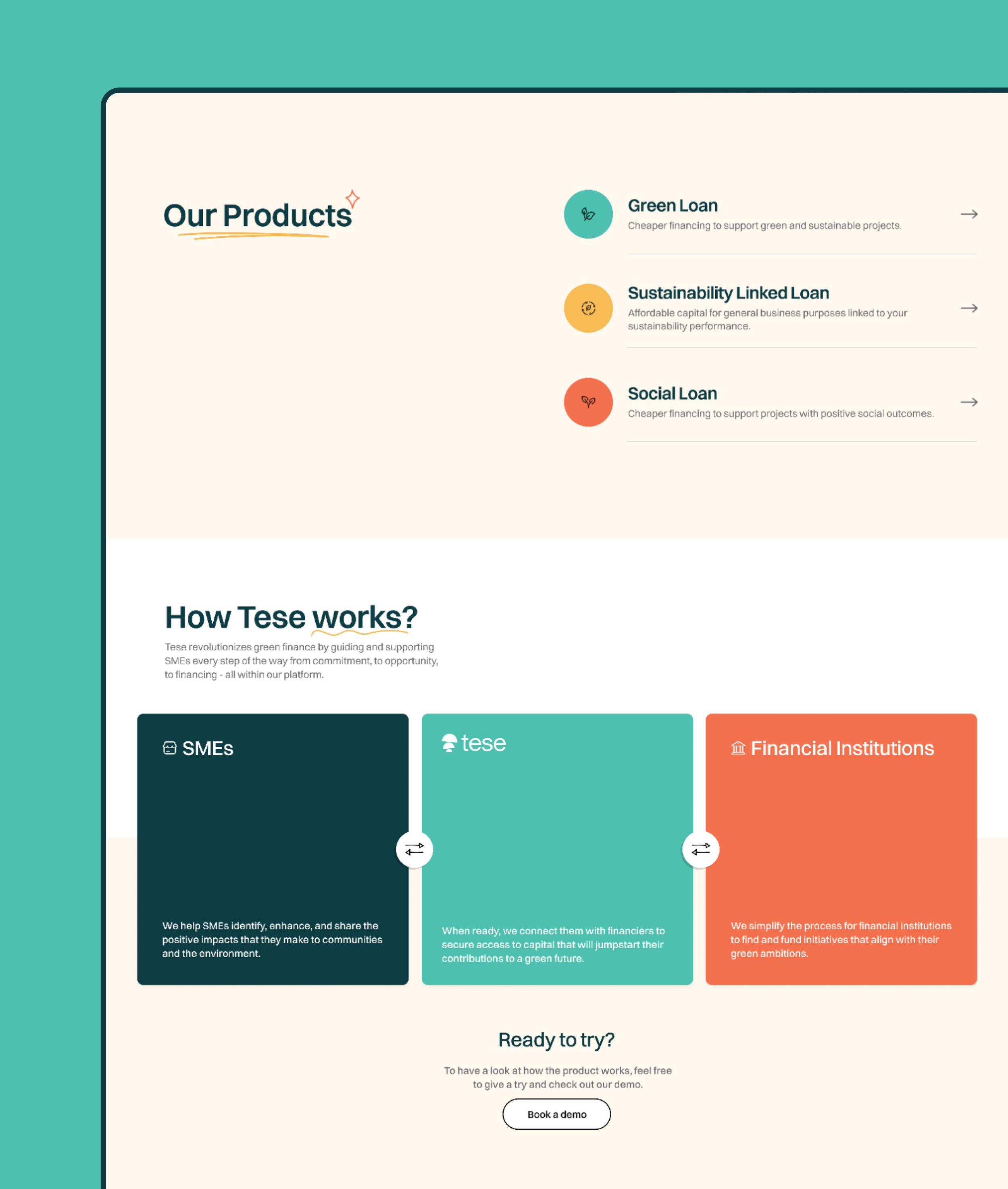
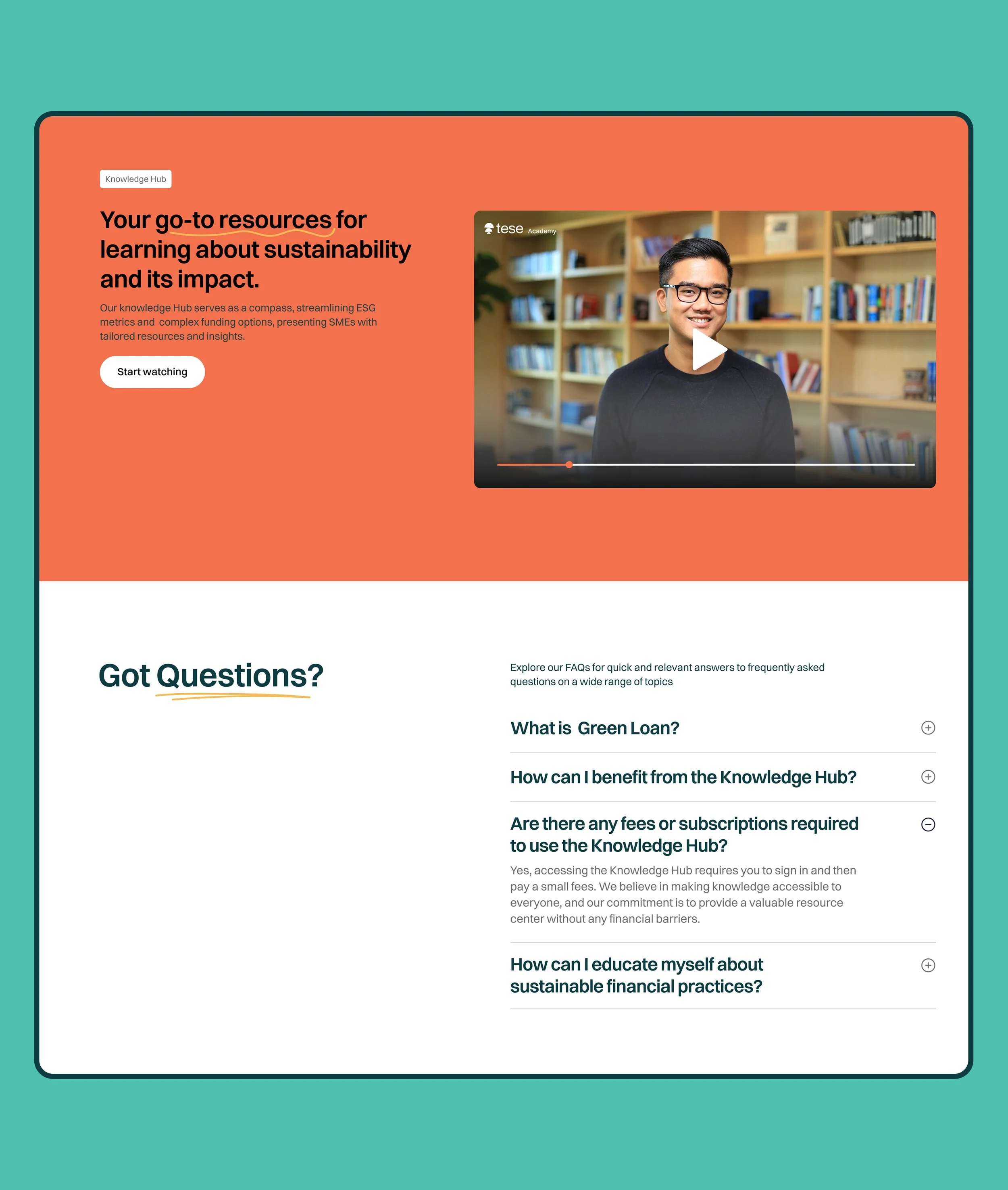
Section 3: Knowledge Hub & FAQs
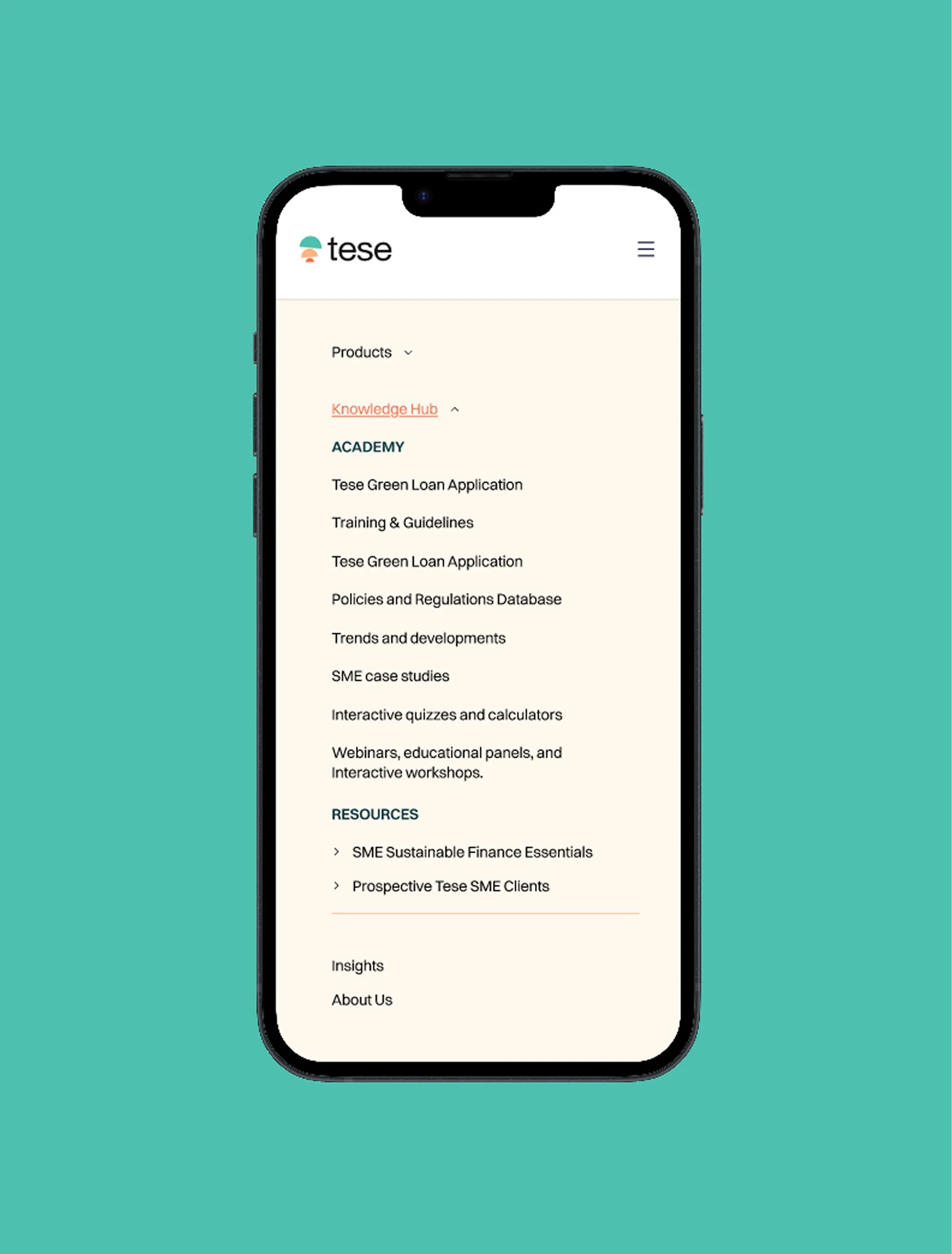
Nested Nav Bar
02/ The SME Loan Application Flow
Impact
Streamlined a complex ESG financing application into a progressive, plain-language workflow that reduces drop-offs and eliminates ambiguity for business owners.
Designing a Frictionless SME Loan & ESG Application Flow
The Challenge: Streamlining complex sustainable finance applications (SFPs) for Small and Medium Enterprises (SMEs) without overwhelming users with dense legal or technical jargon.
The Goal: Reduce cognitive load, improve conversion rates, and create clear visibility into application status.
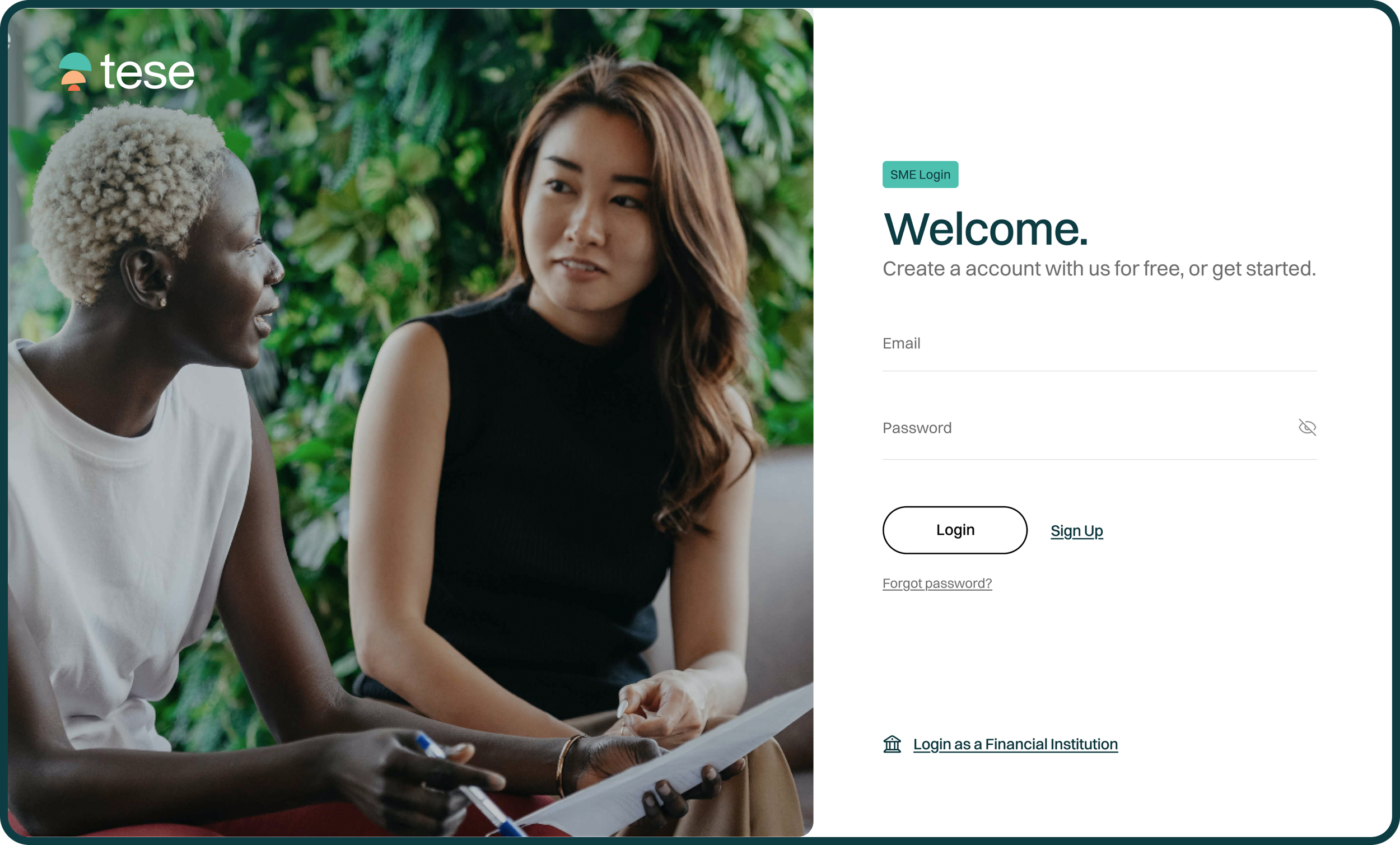
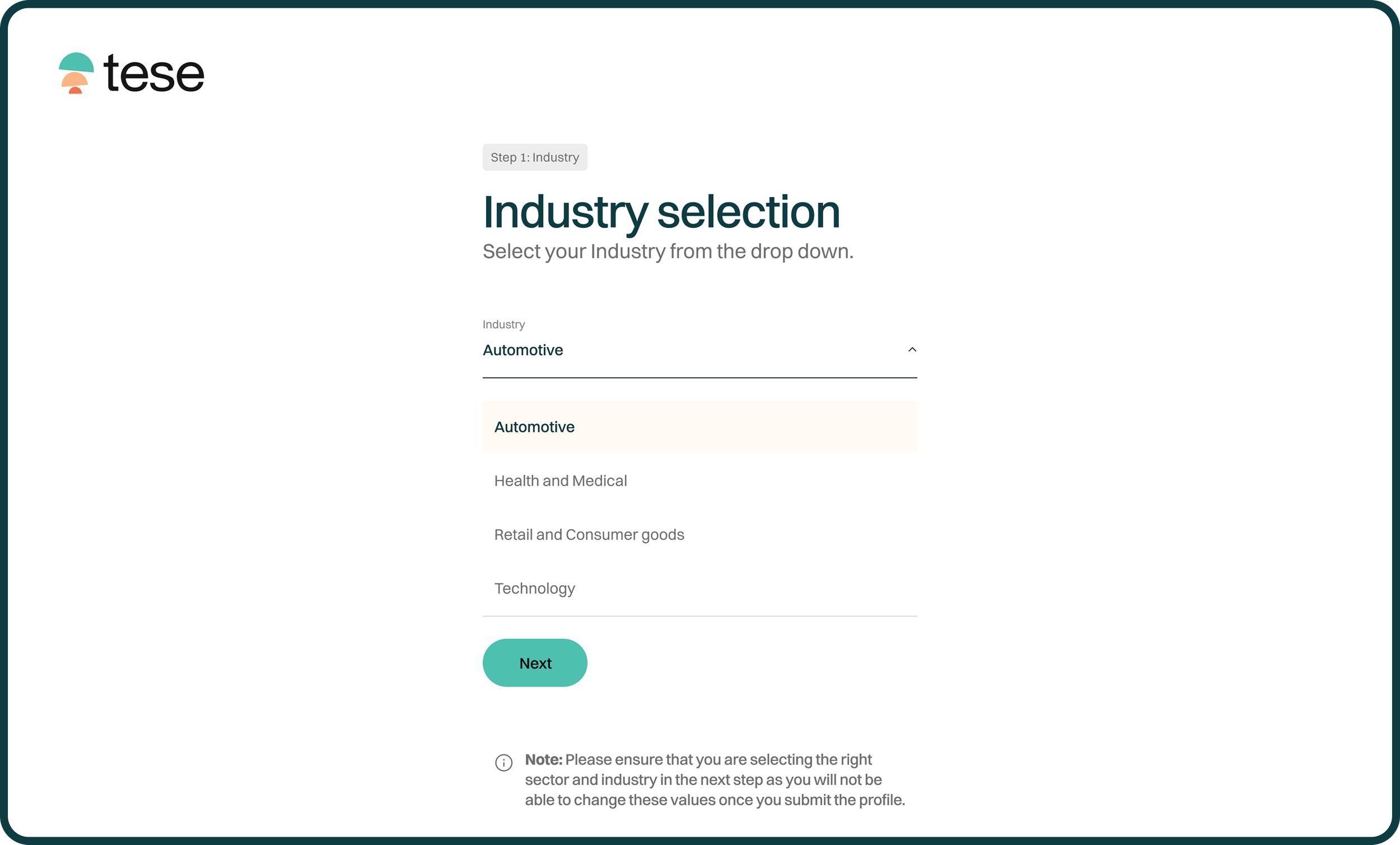
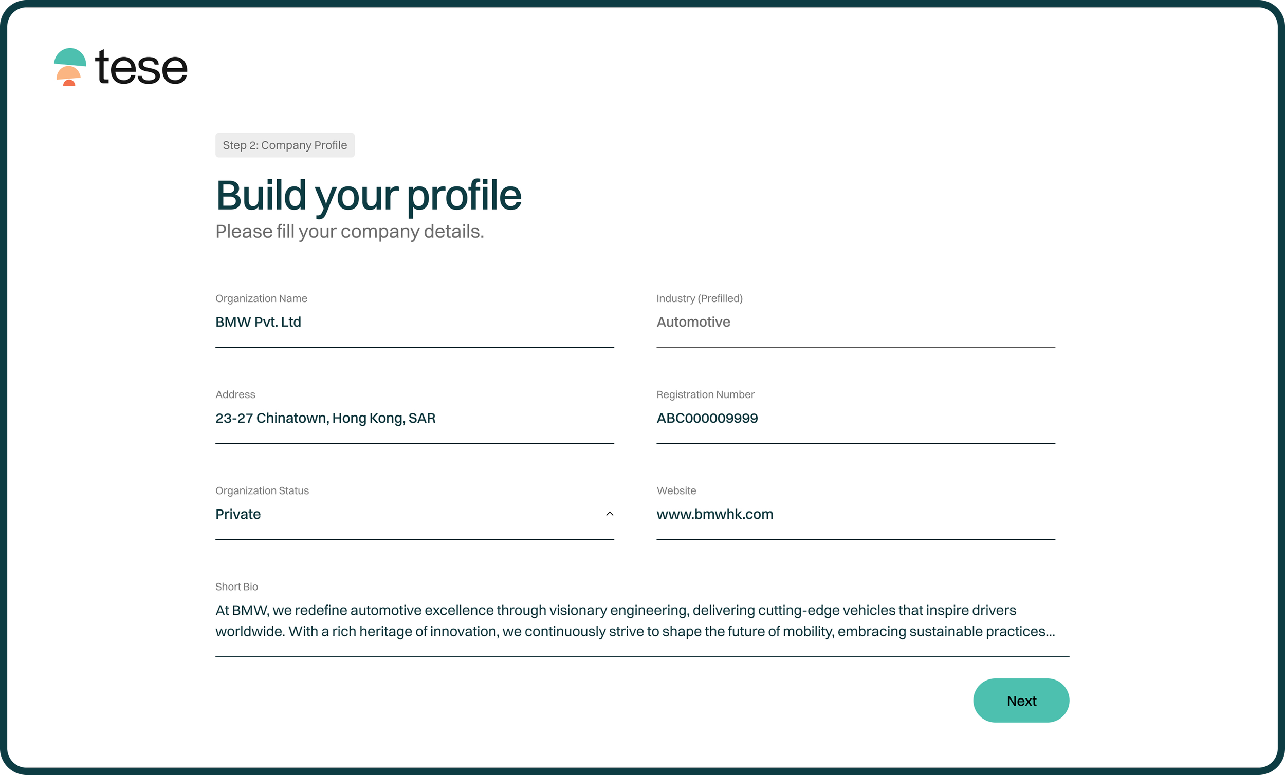
SME Profile creation
I designed a streamlined 3-step onboarding architecture that instantly translates company profile and industry inputs into a customized dashboard, delivering clean ESG data that accelerates risk assessments for financial institutions.
Dashboard & Overview (Home State)
The central hub where users view their company profile, active metrics, and overall status where the onboarding data is allocated directly into the dashboard UI.
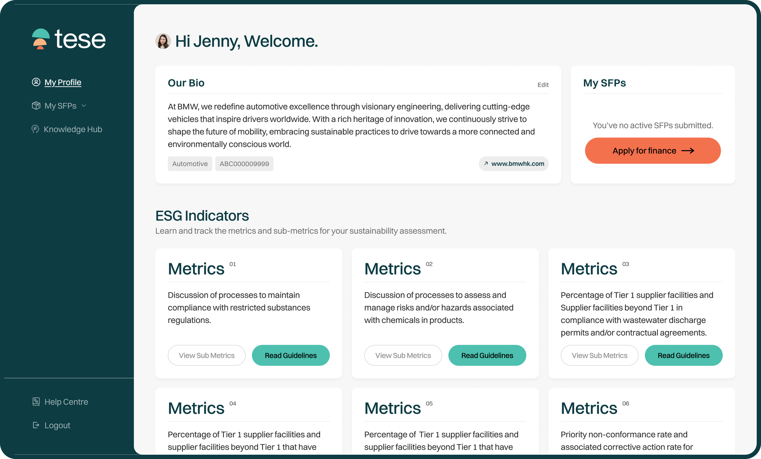
Design Decision & UX Rationale:
Card-based Layout: Grouped ESG indicators into digestible modules so business owners can audit their requirements at a glance.
Clear Call-to-Action (CTA): Placed a prominent "Apply for finance" button alongside active status summaries to minimize navigation friction and guide users directly into the funnel.
Step 1: Loan & Project Selection
The initial project type selection screen (Green Project, Social Impact Project, Finance for Business).
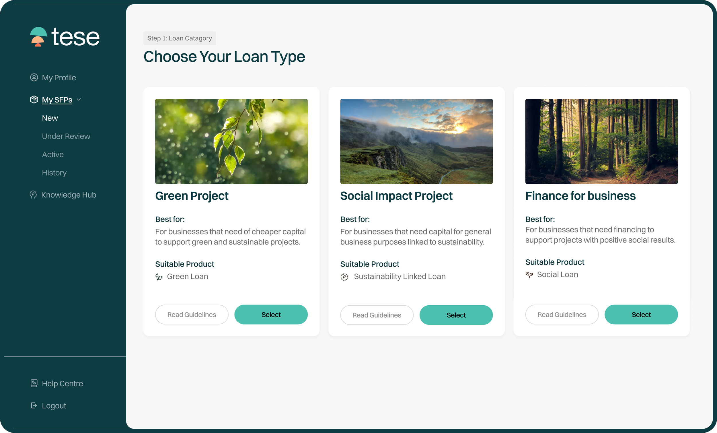
Design Decision & UX Rationale:
Visual Anchor Cards: Used distinct, context-relevant imagery paired with "Best For" descriptions. This helps SMEs instantly identify which financial product matches their sustainability model without needing to parse heavy legal definitions.
Clear Step Guidance: Implemented a persistent "Step 1: Choose Loan Type" header to orient users within a multi-step workflow.
Step 2: Form & Metric Configuration (In Progress)
Detailed data input for Risk Management, featuring collapsible accordion sections and metric dropdowns.
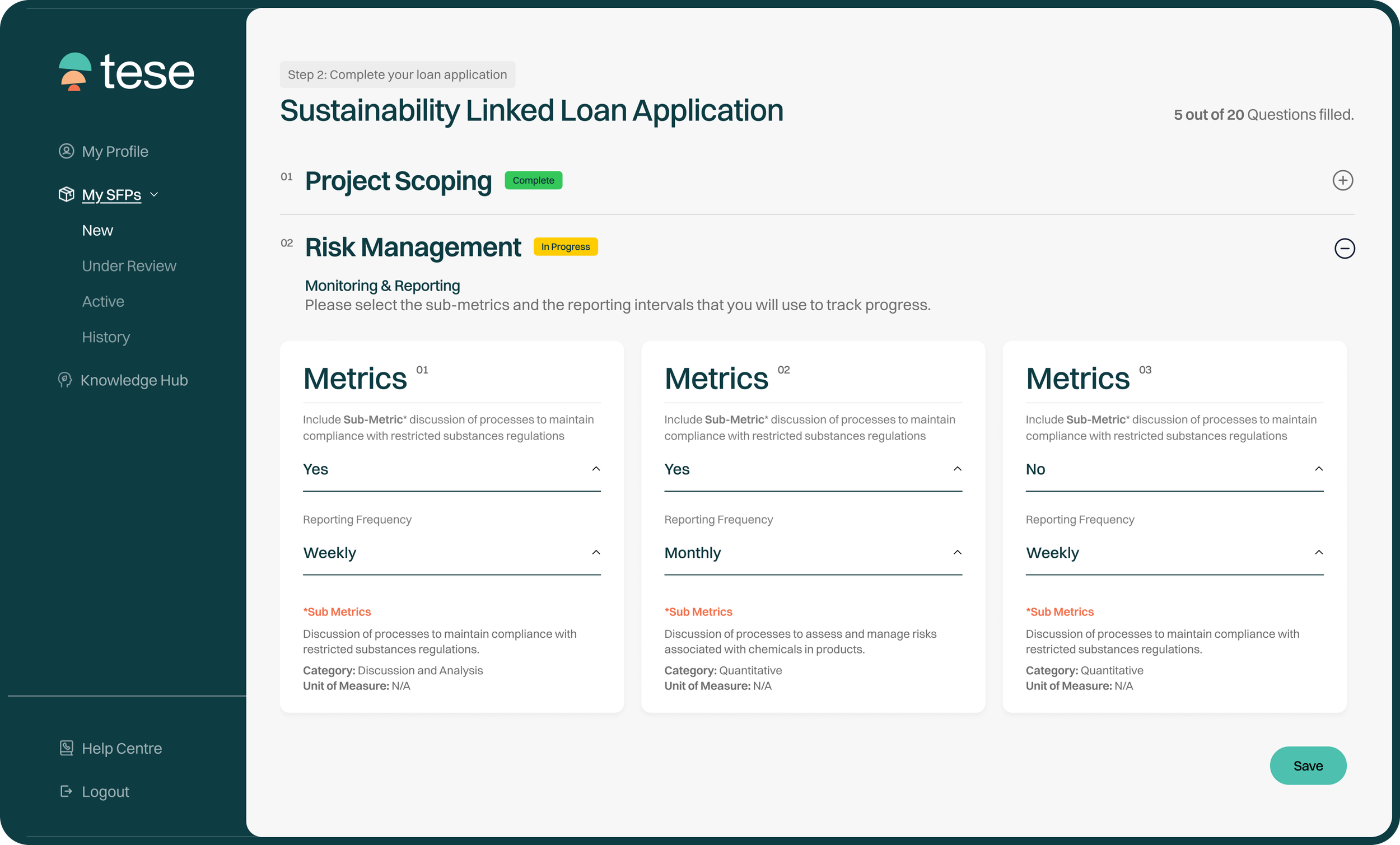
Design Decision & UX Rationale:
Progressive Disclosure: Broke a massive questionnaire down into manageable sections (Project Scoping, Risk Management, etc.) with real-time completion tags ("Completed" vs. "In progress"). This prevents cognitive overload on data-heavy compliance forms.
Simplified Micro-Copy: Refined verbose metric labels into clean, direct field names ("Reporting Frequency" instead of long-winded data collection descriptions).
Step 3: Review & Submit (Terms Agreement)
Final submission screen containing the Project Management Agreement and legal terms.
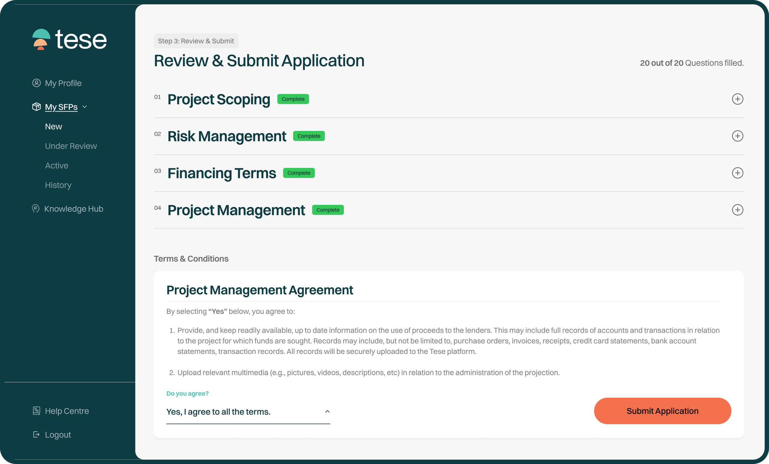
Design Decision & UX Rationale:
Plain Language Compliance: Condensed dense legal clauses into numbered, scannable commitments so business owners can quickly understand their obligations before checking the authorization box.
High-Contrast CTA: Isolated the final "Submit Application" button to create a clear psychological checkpoint for the user.
Application Success Modal
Confirmation popup indicating successful submission with an application tracking ID.
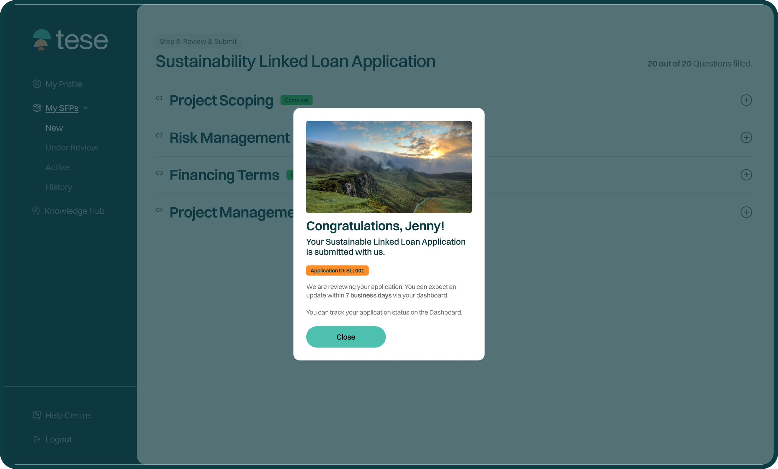
Design Decision & UX Rationale:
Immediate Feedback & Reassurance: Replaced ambiguous waiting instructions with precise timeline expectations ("7 business days") and direct instructions on how to track progress via the dashboard.
Real-time Updated Dashboard: Post-submission dashboard to act as an active tracking hub, showcasing real-time status updates (under review), application IDs, and accessible ESG indicator cards so users can monitor progress and manage multiple projects seamlessly.
Impact
Successful Launch
The work helped Tese launch a product with confidence, defined market positioning and enhanced Brand presence among the ESG market and products.
The product also established first round fundraising and 30+ sign-ups at Saigon Textile Expo 2024.
Winner at the 2024 G20 TechSprint
The Anyway platform continued to grow beyond the initial US expansion.
The AI-powered career experience later became part of a major education initiative in which Microsoft and Anyway co-funded an AI-powered Career Coach for 1,000 high schools across Australia.
While this partnership involved the broader organisation and product, it reinforced the importance of building an AI experience capable of supporting young people at scale.
Reflection
This project changed how I think about UI design. Good UI design is not only about creating individual screens that look polished. It is about creating a visual and interaction language that can survive beyond the original designer. The strongest part of this project was learning how to translate an abstract brand direction into practical decisions that designers and engineers could repeatedly use.
I learned that a successful design system needs to balance two things:
Consistency: The experience needs shared rules.
Flexibility: The system needs to support new problems without becoming restrictive.
That balance became central to how I approached the design of Anyway.
Fin.
You might also like

Occubuy
Rebranding and boosting recognition for Australia's new homeownership app, achieving 3,000+ user downloads.
Brand Identity | Web (UX/UI) Design