
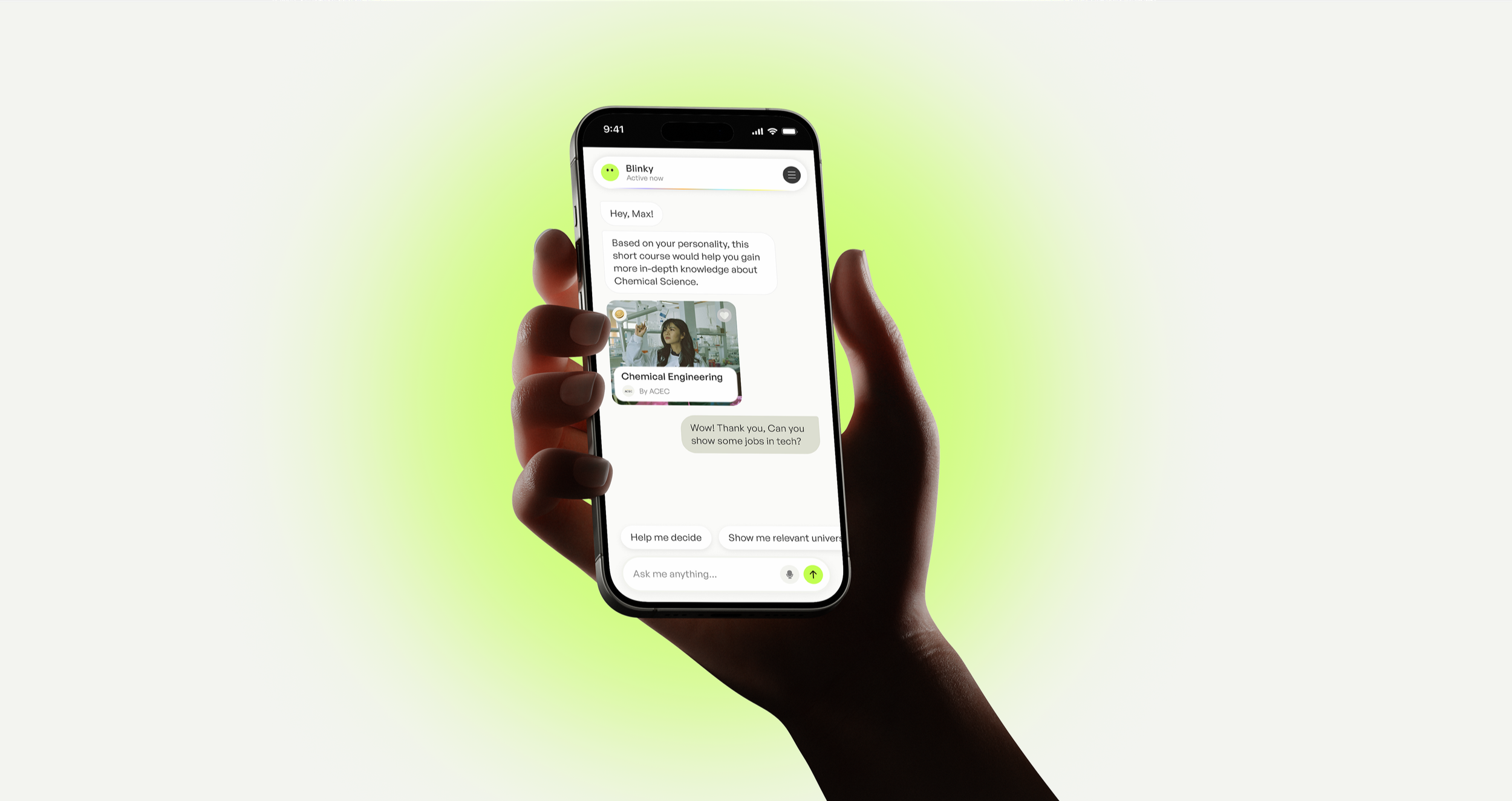
Anyway (formerly Year13)
How I built a scalable UI system and improved the UX for Anyway's US launch.
Product (UX/UI) Design | Responsive Design | Design System
Roles and Responsibilities
Lead Product Designer: Core Conversational chat AI experience.
UI Specialist: Design Systems, Responsive Design (Web App) & Development.
Timeline and Team
April 2024 - April 2025
Design Head: John Holland; Sr. UX Designer: Sujoy Chakraborty
Tools
Communication & Project management: Slack, Jira & Confluence.
Design & Development: Figma & Storybook (Testing & Documentation).
Background
In Australia, the average student-to-advisor ratio is a staggering 560:1. Since 2011, Year13 had built a strong presence in Australia reaching 1.6 million young people supporting young people as they navigate education, work and life after school. Year13 decided to go global, starting with the United States.
However, expanding into the United States required more than launching the existing Australian product in a new market. The brand and the product needed a new identity, cultural understanding of the users and an interface that could work consistently across devices. And, to shift away from corporate structures toward a youth-centric narrative, Year13 rebranded to be Anyway, an AI-powered career exploration platform build around consideration - designed to help young people explore possible career paths before making a decision.

Image Courtesy: Otherway
The Problem
The Brand direction provided us with a strong visual expression and art direction. However, it was not a production-ready UI system.
As the product began moving towards implementation, and engineering trying to reskin the Year13 design system to the new brand, it caused friction. As there were no defined:
UI component rules
Component States, variables and
Responsive guidelines for Desktop & Mobile.
The gap between brand direction and production became increasingly visible making it was clear that without a shared system, the product risked becoming disjointed screens rather than a consistent experience.
My initiatives
Working closely with the product and engineering teams throughout the process, I eliminated guesswork, streamlined handoffs, and humanized the AI experience, while focusing on creating a clearer connection between: Brand → Design → Components → Development.
My role was to help turn a newly developed brand direction into a functioning digital product, which meant solving solving three connected critical challenges:
Architecting a Scalable Design System (Tailwind CSS & Storybook).
Designing fluid Multi-Breakpoint architecture, and
Humanizing the AI Conversational Experience for - Blinky.
Solution
01/ Architecting a Scalable Design System (Tailwind CSS & Storybook).
Impact
Removed manual reviews and endless back-and-forth, tightening design-to-code alignment.
Bridging the Gap
With the toolkits visual direction, I decided to take a systematic approach and rules that can be applied repeatedly and consistently. Rather than treating every screen as an individual design exercise, I translated Otherway’s visual identity into a robust, production-ready design system built on Figma Styles, and Variable specifications powered by Tailwind CSS guidelines.
These included the the complete foundational design elements and product UI components.
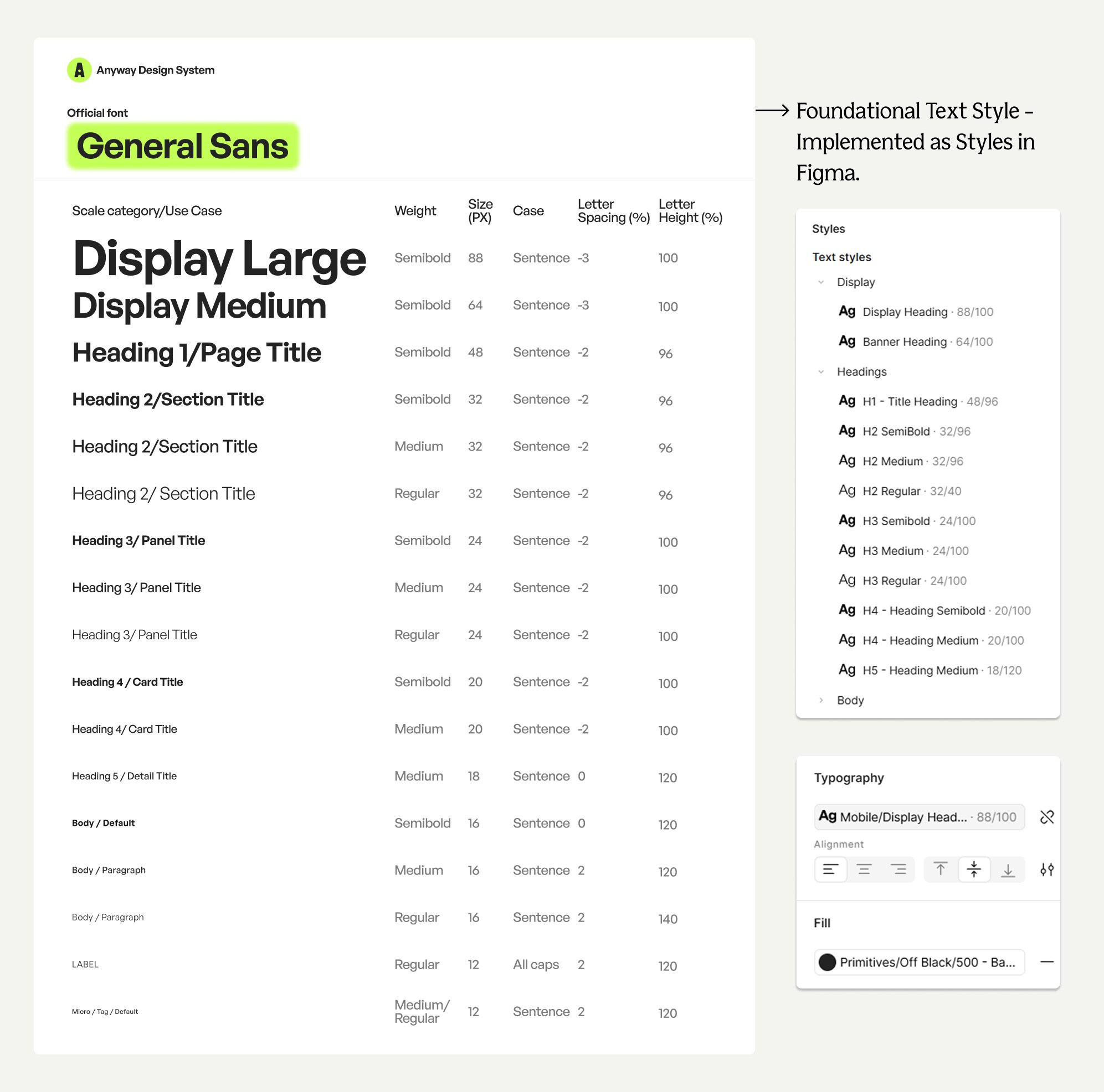
Implementation of foundational typographic styles, in Figma.
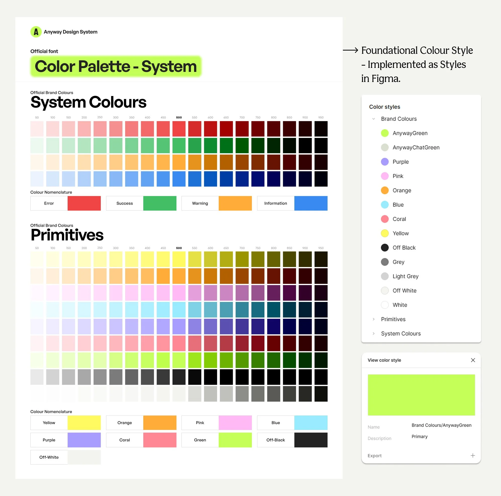
Implementation of foundational colour styles, in Figma.
Design-Dev Alignment
To ensure a smooth design translation from design language to neat CSS code, I meticulously audited and documented every component inconsistencies, synchronizing Figma token structures directly with Storybook. This allowed designers to pull standardized components with states and gave developers a granular, predictable codebase.
My goal was to create a system that preserved the personality of the brand while remaining practical for a real product. This became the foundation for Anyway’s core UI system.
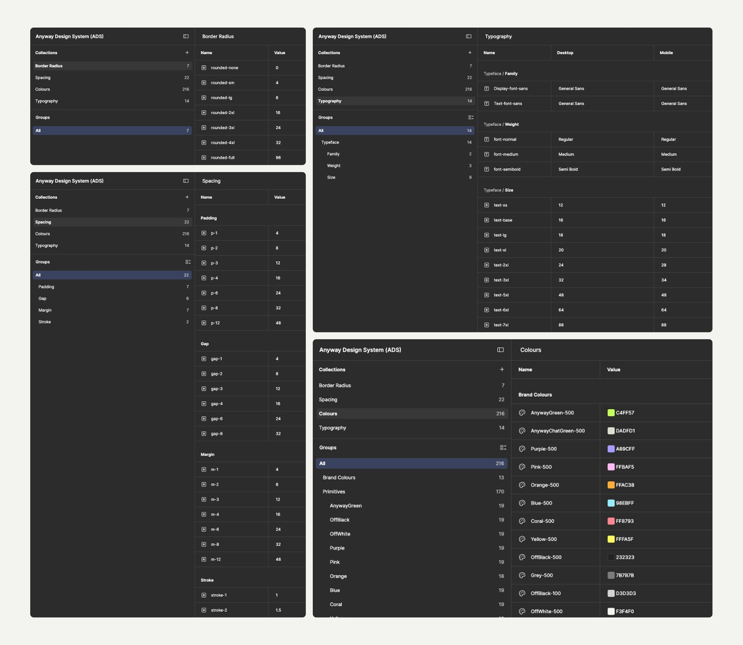
Example of how I used Tailwind CSS values to define Figma variables for Radius, Spacing (Padding, Gap, Margin, Stroke), Colours & Typography.
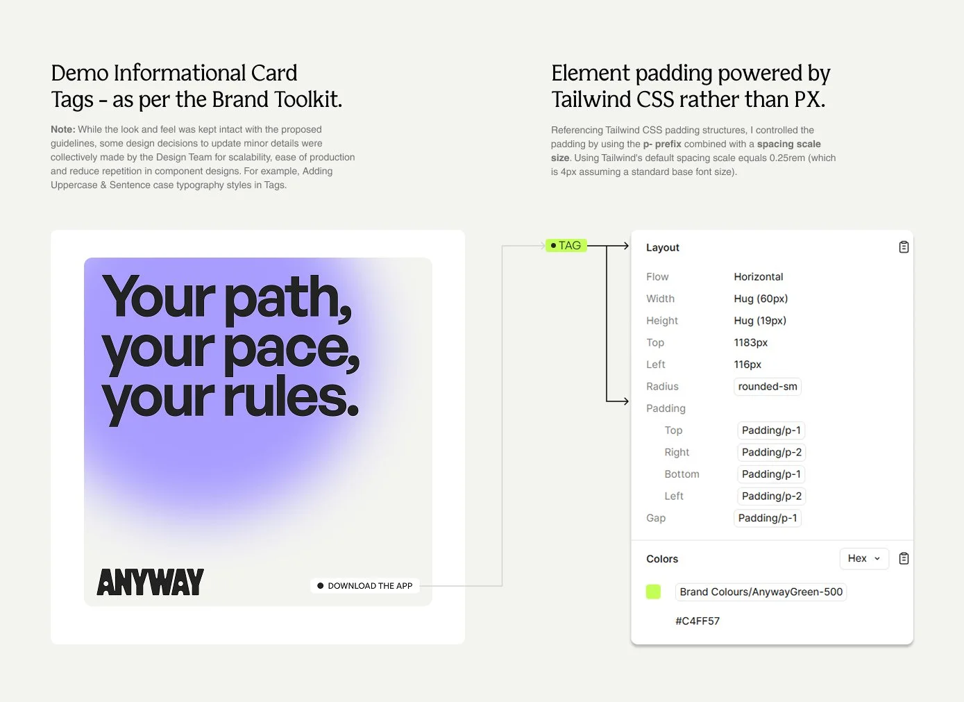
Example of how I turned Toolkit designs into shippable UI.
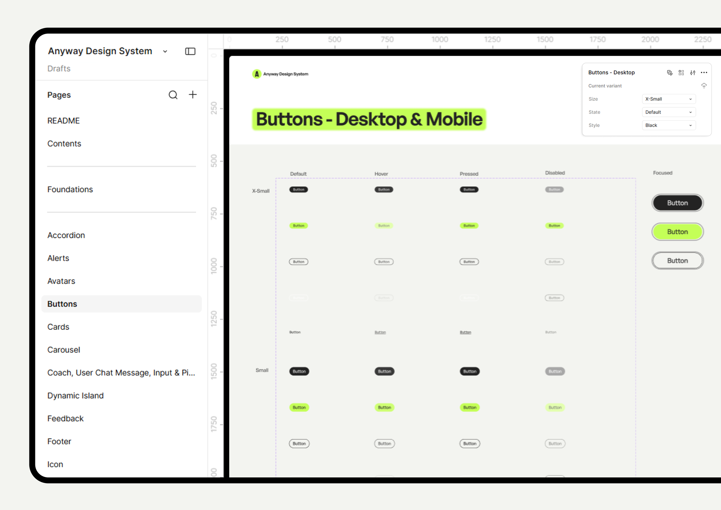
Example of how I structured Design system file, UI component states and properties.
02. Designing fluid Multi-Breakpoint architecture
Impact
Streamlining delivery by using advanced Figma components and layout systems, enabling engineers to build mobile views without layout rework.
Designing for consistency
To ensure the product translated seamlessly across devices without sacrificing UX, I designed and deployed responsive multi-breakpoint layouts simultaneously across web and mobile viewports. This included the product consumer facing screens and every navigational touchpoints and Anyway website for users and businesses.
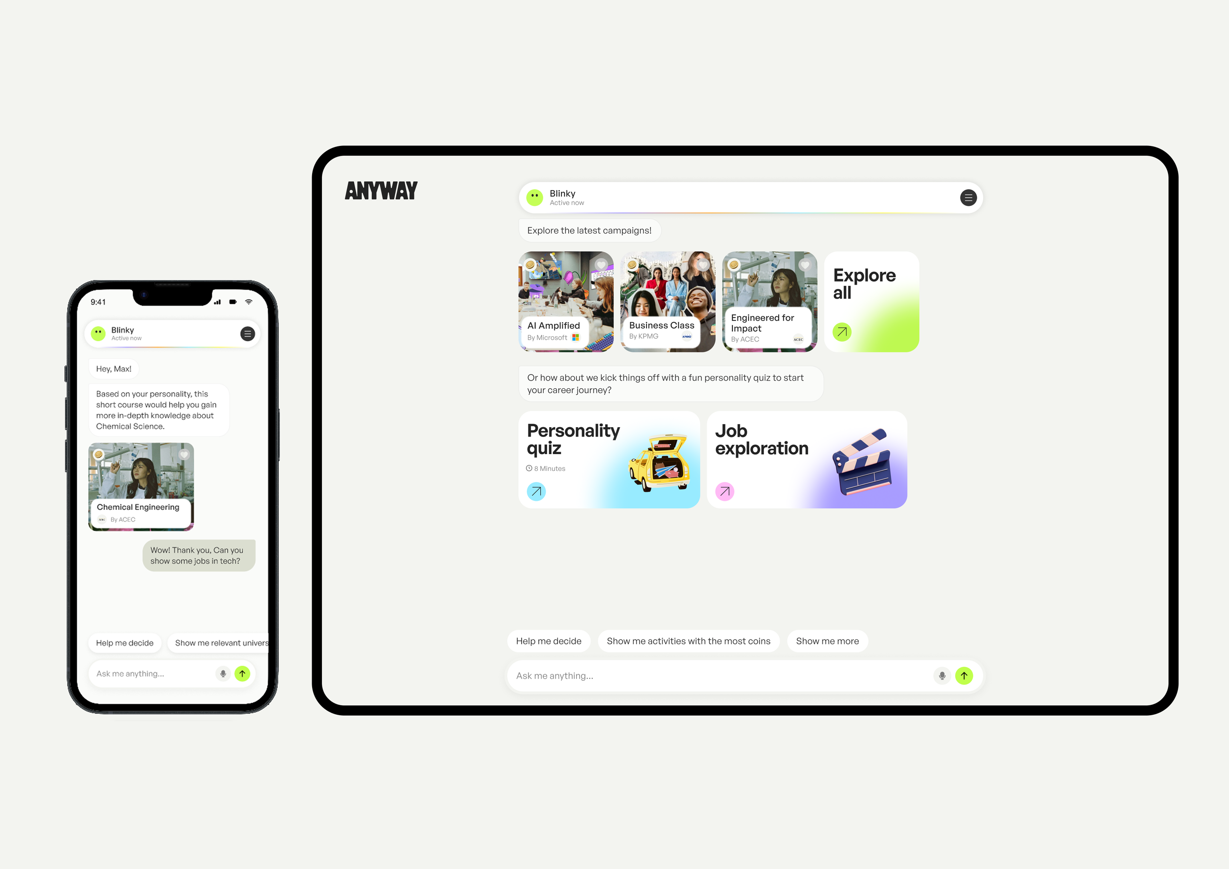
In Product: Anyway Blinky chat responsive design for Mobile & Web.
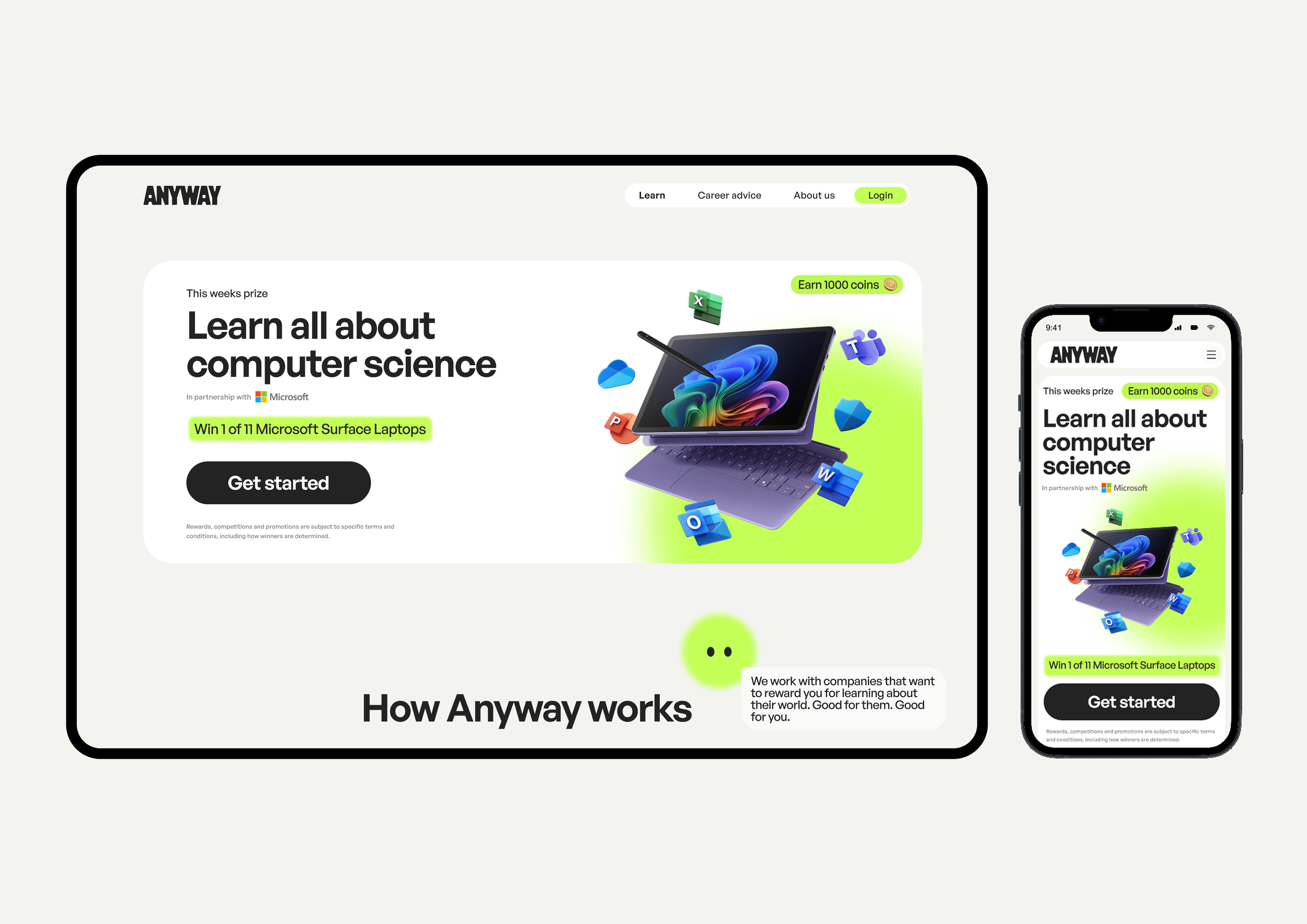
Anyway Public Website: Responsive Learn page designs for Mobile & Web.
03. Humanizing the AI Conversational Experience for - Blinky.
Impact
Improved the UX engagement by reducing blank page problems and likeability of Blinky conversation from a AI Chatbot to a fun playful mentor.
Designing for consideration and engagement
The core of Anyway relies on conversational guidance from Blinky, an AI career coach. However, a simple powerful AI chat feature didn’t feel natural and real. Therefore, to combat students anxiety and build trust, I designed an intuitive, low-friction conversational UX.
Problem:
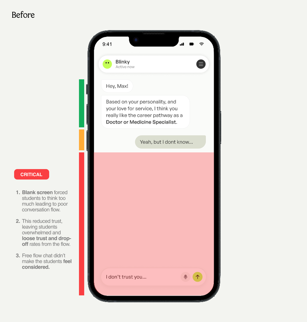
A pilot moderated usability test with ten students in Australia and the US found they didn’t trust Blinky for career advice and felt stuck. They couldn’t take action, stay motivated, or focus, which made the experience tiring and confusing.
Insight:
A completely open-ended chatbot created uncertainty because users didn't know:
What the AI could do & What to ask,
Felt overwhelmed, confused and increased drop-offs and,
Whether Blinky understood their situation or considered what was asked to help with.
Interaction Mechanics & Solution:
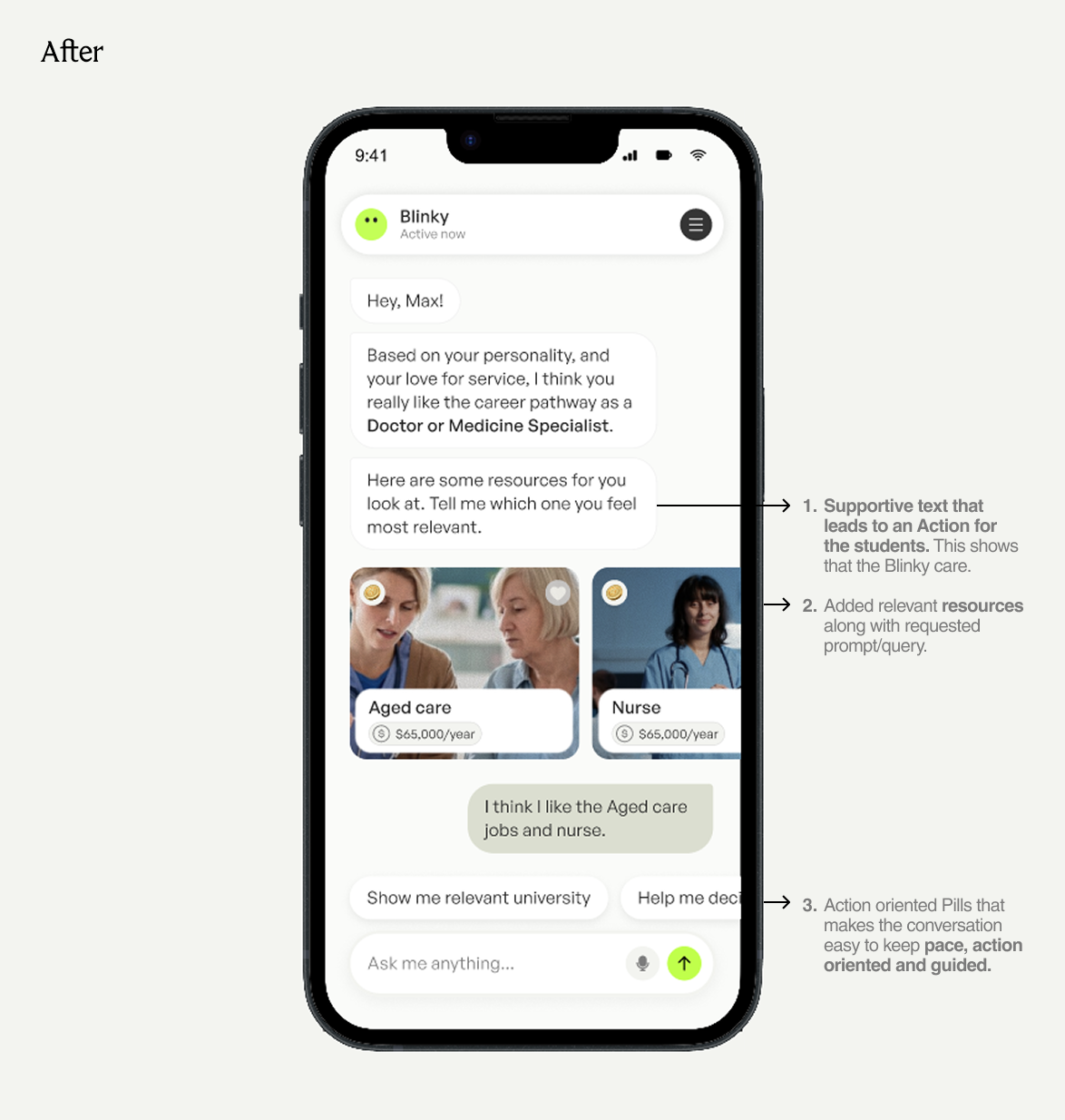
To make the UX easy and considered, I made these design decisions:
Added Caring, Supportive & empathy based end-text at the end of the Blinky response, making Blinky feel human and considered.
Created Resources in the form of quick selection Interactive card, Quizzes within the chat stream for in-depth explorations.
Ensured Blinky felt like a supportive, playful mentor rather than a cold algorithm, reducing cognitive load by designing action-oriented pill prompts to guide users naturally through exploratory flows without overwhelming them.
Impact
Successful US Launch
The work helped transition Anyway from a new brand direction into a production-ready product experience for the US market unifying the product experience across web and mobile.
The project also established a stronger foundation for the product to evolve. By creating reusable UI patterns and improving the relationship between design and development, new experiences could be built on shared foundations rather than starting from scratch streamlining the handoff process and accelerating delivery timelines.
Beyond the US Launch
The Anyway platform continued to grow beyond the initial US expansion.
The AI-powered career experience later became part of a major education initiative in which Microsoft and Anyway co-funded an AI-powered Career Coach for 1,000 high schools across Australia.
While this partnership involved the broader organisation and product, it reinforced the importance of building an AI experience capable of supporting young people at scale.
Reflection
This project changed how I think about UI design. Good UI design is not only about creating individual screens that look polished. It is about creating a visual and interaction language that can survive beyond the original designer. The strongest part of this project was learning how to translate an abstract brand direction into practical decisions that designers and engineers could repeatedly use.
I learned that a successful design system needs to balance two things:
Consistency: The experience needs shared rules.
Flexibility: The system needs to support new problems without becoming restrictive.
That balance became central to how I approached the design of Anyway.
Fin.
You might also like

Tese
How Earth - Centric design empowered SMEs to manage performance, purchase tangible green solutions, and access sustainable capital - all in one place.
Product Design | Web (UX/UI) Design