Page with brand guidelines for a company named Occupuy, showcasing logo variations, a contents list, a family photo, and hierarchy information about the brand values and scale.

Occubuy

Redesigning the Brand Identity and Web for Occubuy - resulting in increased brand awareness, trust and app download by 3000+ users.

Brand Guidelines, Brand Identity and Web Design.


Roles & Responsibilities

Design Lead: Design Direction & UX Storytelling.
Web Design: Layout design, Copywriting & Implementation. 

Client & Project type

Occubuy - Get rewarded for your rent.
Independent Contractor/Freelance.

Timeline and Team

2 Months, August - September 2024.
Jr. UX/UI Designer:
Kasey Lin

Tools

Web Development: WordPress - Elementor.
Ideation & Design: Sketching, Figma, Adobe Photoshop & Illustrator.

Background

Occubuy is an Australian start-up dedicated to making homeownership achievable, simple, and stress-free.

Occubuy had a strong vision of representing renters, and worked towards providing incentives every time users pay your rent via their app. However, the challenge they faced were:

  1. To build trust among the new users/early adopters,

  2. Create an impact in the Homeownership landscape and,

  3. Increase brand reach by engaging storytelling.

Therefore, my work spanned designing and leading the brand identity & website redesign, app store refinements and brand guidelines that support the redesign and establish a new standard for future growth.


Solution

The 8 weeks sprint based-design approach delivered:

  • Professional brand evolution focusing on the brand “trust” essence.

  • Concise brand guidelines emphasizing on the brand storytelling.

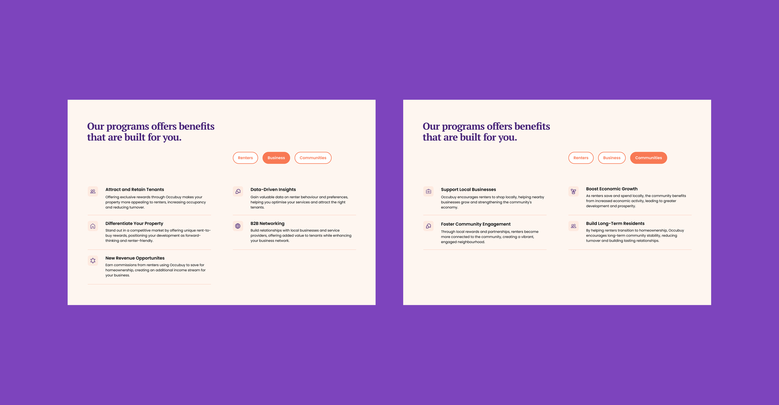
  • Complete website redesign with a focus on converting visitors to active users.

  • Enhanced Mobile app design complimented by Google play store and App store redesign.

A collage of slides from a presentation. The slides feature logo designs, brand guidelines, a contents page with an image of two children and a woman organizing boxes, and text slides discussing hierarchy, family, and branding elements.
A promotional webpage for a rent reward app called Occubuy, featuring a smartphone displaying the app interface, with app download links from the App Store and Google Play, set against a purple background.
Close-up of a smartphone screen displaying various app icons, including Calendar, Occubuy, and Mail, against a purple background.
Note: Design presented in this case study may/can have undergone update since the time of writing the case study.
Promotional webpage for a rent rewards app with the headline 'Rent. Earn. Buy. It’s that easy.' and images of the app interface showing rent payments, rewards, and homeownership timeline.
A colorful webpage with a purple background promoting rental services. The top section has the heading "Simple. You pay your rent, We do the rest." with a speech bubble saying "YES!" next to it. Below are four icons with descriptions: Earn Rewards, Home plan that fits, Budget & Save, and Credit Score. The lower section has a mission statement in bold purple text: "Our mission is to transform renters into successful homeowners, and we take your dreams seriously," with a small yellow star graphic above it.
Comparison of two similar informational posters on benefits of programs, with purple background. Each poster has sections titled 'Our programs offer benefits that are built for you,' with categories 'Renters,' 'Business,' and 'Communities' highlighted in orange. The left poster lists benefits such as attracting tenants, data insights, networking, and revenue opportunities. The right poster emphasizes local business support, community engagement, economic growth, and long-term resident building.
Screenshot of a website promoting a rental property management app called Occubuy. The page features a large message encouraging users to get closer to homeownership with each rental payment, with download links for the App Store and Google Play. There are also buttons promoting fee-free rentals, ease of use, and becoming an occupier. The website's footer includes links about the company, partners, and blogs, along with options to join social media platforms and a feedback form.
Promotional graphic for an app called Occubuy, encouraging renters to join by downloading the app or scanning a QR code. The background is purple with a central orange rectangle containing white text about transforming renters' lives using Occubuy.
A smartphone displaying an app interface for Rental property management on a purple background with the text "Rent. Earn. Buy." and a download button at the bottom.
Visit Occubuy

Impact

The collaborative approach achieved significant results:

  • Successfully elevated brand online presence with 150% engagement growth (Instagram/TikTok/Facebook).

  • Improved the brand look, storytelling, engaging copy and,

  • Significantly achieved:

Over 3,000 downloads on both Google Play and the App Store.

1,500 new followers on Instagram, Facebook & over 1M view on TikTok.

Fin.


Read my next case study

Tese: How Earth - Centric design empowered SMEs to manage performance, purchase tangible green solutions, and access sustainable capital - all in one place.